


Creating the rich user interface |
513 |
|
|
Figure 13.4
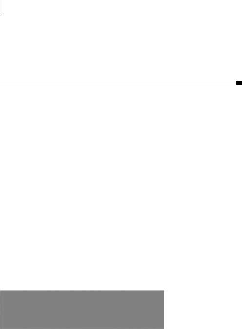
HTML elements are shown without any CSS
j buttons are added to the div. The select form element and a button 1) are added that allow a user to select additional XML feeds. This now finishes up the basic framework for the viewer, as seen in figure 13.4.
Figure 13.4 is not visually appealing since we have not formatted our HTML elements. The viewer lacks any structure, but that changes when we add CSS rules to the elements. By looking at figure 13.3, we see that our two divs, divNews1 and divNews2, need to be sitting on top of each other in order for our fading effect to work properly.
13.2.3Compliant CSS formatting
Without CSS, our web pages would all look like those in figure 13.4: very boring and unpleasant on the eyes. We’ll apply some CSS to make this example more pleasing. The style allows us to easily edit the properties in the future without having to edit the HTML. The first thing we can apply style to is our holder div and our header row.
Applying style to the holder and header divs
The divNewsHolder div mentioned earlier can be considered our container for the viewer. It allows us to position the reader on the page and also set the width of the reader. Since we are using divs for our other rows, they take up 100 percent of the width that is available to them. By setting the width in the holder, we can dictate the width of the other elements, making future updates easier. Listing 13.2 shows how we achieve this using CSS.
Listing 13.2 CSS for the holder and header divs
#divNewsHolder{ |
b The holder div |
width: 600px; |
|
border: 2px solid black; |
|
padding: 0px; |
|
} |
c The title div |
#divNewsTitle{ |
|
font-size: 20px; height: 26px;
514CHAPTER 13
Building stand-alone applications with Ajax
background-color: #BACCD9; line-height: 26px; d Height of line
} |
e The count span |
#spanCount{ |
float: right; f Float-based layout font-size: 15px;
padding-right: 10px;
}
We apply style to our form elements by referencing its ID along with the pound
(#) sign b. This specifies that the style should be applied to only our div with the id divNewsHolder. For our divNewsHolder, we can assign width and border rules to it and set the padding to 0.
Now that we have set our holder div, we can style our first row. We want to set the height, background color, and font size of div divNewsTitle c. The lineheight property dis set to the height of the div. This ensures that our single line of text that is 20 pixels high is centered vertically in the div. Without the line height, the text would be located at the top border of the div.
The last step for formatting our header row is to move the spanCount eto the right portion of the header instead of it being in front of our title. To do this, we use the float property fand set it to right. This right-aligns our text, whatever the width of the containing element, and does not affect our title. The font size can be set to a smaller pixel height so it is not as prominent as our title. The padding-right property moves the text from the right edge so it is not sitting directly on the border. We are now finished with our holder and our header row; see figure 13.5.
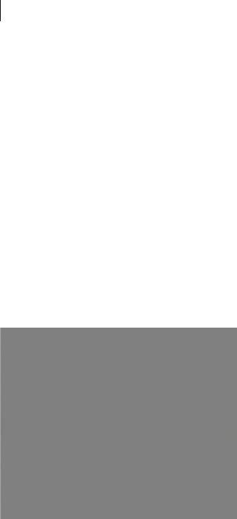
In figure 13.5, we can see that the header row is very different compared to the other rows that have not been styled. The word Loading appears on the right side of the div, and our text is centered in the div. The holder div border surrounds the rest of the elements; now we need to work on the content divs.
Figure 13.5
CSS is applied to the holder and header divs.
Creating the rich user interface |
515 |
|
|
Styling the content divs
The next step is to style the middle section or the body of our RSS reader (listing 13.3). The body section will contain our formatted RSS feed information. We position the divs, divNews1 and divNews2, on top of each other for our transition effect to work. The transition effect is to change the opacity of the layer so the layer contained below shows through. By increasing the opacity level of the layer, we are able to create a fading effect.
Listing 13.3 CSS for the content divs
#divAd{ |
b Format divAd |
|
|
|
|
|
|
||||
width: 100%; |
c Set width |
|
|
|
|||||||
height: 400px; |
d Set height |
|
|
|
|||||||
overflow: hidden; |
e Hide scrollbars |
f |
Format |
||||||||
border-top: 2px solid black; |
|
|
|||||||||
|
|||||||||||
border-bottom: 2px solid black; |
|
|
|
borders |
|||||||
|
|
|
|
|
|||||||
} |
|
|
|
|
|
|
|
|
|
|
|
#divNews1, #divNews2{ |
|
g Style both news divs |
|||||||||
width: 100%; |
|
|
h |
Set width and |
|
|
|
||||
|
|
|
|
|
|||||||
height: 400px; |
|
|
|
height |
|
|
|
||||
|
|
|
|
|
|
|
|
|
|||
background: #D9CCBA; |
|
|
|
|
|
|
|
||||
position: relative; |
|
i Use relative positioning |
|||||||||
overflow: auto; |
|
j Show scrollbars if necessary |
|||||||||
left: 0px; |
1) |
Move divs to the edge |
|
|
|
||||||
} |
|
|
|
|
|
|
|
|
|
|
|
#divNews1{top: 0px;} |
1! Position first div |
|
|
||||||||
#divNews2{top: -400px;} |
1@ Position second div |
||||||||||
|
|
|
|
|
|
|
|
|
|
|
|
|
|
|
|
|
|
|
|
|
|
|
|
The first step is to style our div divAd bthat is the container for our feed spans. The width c is set to 100 percent, and the height d is set to 400px. We do not want scrollbars to appear for the row; therefore, the overflow eproperty to set to hidden. This means if any content is larger than 400 pixels, it is hidden from the view. The other divs inside this holder allow for scrolling so we do not lose the content. We then set our top and bottom borders f styles by setting a solid 2- pixel black line. A side border is not needed since our holder div contains a border thickness. If we applied the borders all the way around our row, it would be 4 pixels wide instead of 2 on the sides and only 2 pixels tall on the top and bottom of the row, which makes it look awkward.
We have to format our two content holder divs, divNews1 and divNews2 g. We can style the properties that are the same between them by separating both of
516CHAPTER 13
Building stand-alone applications with Ajax
their IDs with a comma. The width and height values h are set to take up the space of our holder div. By setting our divs’ position ito relative, it allows us to position the divs in relation to our parent div divAd, unlike the absolute position, which is in relation to the top-left corner of the browser window. We set the divs’ overflow property jto auto, allowing scrollbars to appear if necessary. The last step is to set the left 1)position of the divs to 0 pixels, allowing the div to be flush so there are no gaps around the edges.
We want the two content divs to sit exactly on top of each other. Because we are using relative layout, separate position properties are required to be applied to our two feed divs. The div divNews1’s vertical position 1! is set to 0 pixels. This forces it to sit flush to the top border of the parent div. The divNews2 position 1@ is set to –400px. The reason for the negative number is that the second div is positioned lower down the page than the first div, as shown in figures 13.4 and 13.5. Since we set the height of the container div to 400 pixels, we need to move divNews2 up 400 pixels so it is flush on the top of the parent div, just like divNews1. In figure 13.6, we can see how our two divs are now on top of each other, unlike in figure 13.5.
Since the two divs are on top of each other, we are only able to see the content from one of them. In this case, the opacity level is set at 100 percent; therefore, the content underneath is not visible. The level of 100 percent is going to be the last step in our fade transition, but before we can get to that we have to finish styling our reader.
Figure 13.6
CSS applied to the content divs
Creating the rich user interface |
517 |
|
|
Configuring the footer
The last section we want to add CSS to is our footer. In this section, we have to set the background color and standardize the form elements so that the section is more structured. To accomplish this, we set the colors, the font sizes, and the size of the buttons (listing 13.4).
Listing 13.4 CSS for the footer div
#divControls{ b Style footer div |
||||||
background-color: #BACCD9; |
c Set background color |
|||||
text-align: center; |
d Center the text |
|||||
padding-top: 4px; |
|
|
|
|
|
|
|
|
|
|
|
||
padding-bottom: 4px; |
|
e Add padding |
||||
} |
|
|||||
f Style form elements |
||||||
#divControls input{ |
||||||
width: 100px; |
|
|
|
g Set size and |
||
|
|
|
||||
background-color: #8C8C8C; |
|
|||||
|
colors |
|||||
color: #000000; |
|
|
|
|||
|
|
|
|
|
||
font-size: 10px; |
|
|
|
|
|
|
} |
|
|
|
|
|
|
|
|
|
|
|
|
|
|
|
|
|
|
|
|
We apply the CSS to our footer div divControls b so it matches the header row. The background color c is added to the div to match the header’s background color. We align the text d so the content is centered in the div horizontally. Top and bottom padding e is added to the div, which means the content doesn’t have to sit on the border. We don’t have to add a border to our div since the middle row has the top border defined and the holder div has the other three borders covered.
The last step in the CSS for formatting our footer is applying styles to our form elements so they fit in with the style of the reader. The button elements f that are located inside the divControl div are referenced with the div’s name and then a space followed by the tag name. That means only the elements within that div tag get these properties assigned to them. Any of the other elements with the same tag name on the page will not.
Since the text in each of our buttons is a different length, we apply the width property gto the buttons so they will all be the same width, causing the buttons to look more uniform. We change the background color so it is not the default color of the user’s operating system. The text color and the size of the font for the element’s text can be assigned also. Figure 13.7 shows us how our footer is now styled to match the feel of the RSS reader.