


CHAPTER 4: More User Interface Fun |
79 |
Setting View Attributes
Select your image view, and then switch your attention back over to the attributes inspector. Below the Image View section of the inspector is the View section. As you may have deduced, the pattern here is that the attributes that are specific to the selected object are shown at the top, followed by more general attributes that apply to the selected object’s parent class. In this case, the parent class of UIImageView is UIView, so the next section is simply labeled View, and it contains attributes that any view class will have.
The Mode Attribute
The first option in the view inspector is a popup menu labeled Mode. The Mode menu defines how the view will display its content. This determines how the image will be aligned inside the view and whether it will be scaled to fit. Feel free to play with the various options, but the default value of Scale To Fill will work fine for now.
Keep in mind that choosing any option that causes the image to scale will potentially add processing overhead, so it’s best to avoid those and size your images correctly before you import them. If you want to display the same image at multiple sizes, generally it’s better to have multiple copies of the image at different sizes in your project, rather than force your iOS device to do scaling at runtime. Of course, there are times when scaling at runtime is appropriate; this is a guideline, not a rule.
Tag
The next item, Tag, is worth mentioning, though we won’t be using it in this chapter. All subclasses of UIView, including all views and controls, have a property called tag, which is just a numeric value that you can set here or in code. The tag is designed for your use; the system will never set or change its value. If you assign a tag value to a control or view, you can be sure that the tag will always have that value unless you change it.
Tags provide an easy, language-independent way of identifying objects on your interface. Let’s say you have five different buttons, each with a different label, and you want to use a single action method to handle all five buttons. In that case, you probably need some way to differentiate among the buttons when your action method is called. Sure, you could look at the button’s title, but code that does that probably won’t work when your application is translated into Swahili or Sanskrit. Unlike labels, tags will never change, so if you set a tag value here in Interface Builder, you can then use that as a fast and reliable way to check which control was passed into an action method in the sender argument.
www.it-ebooks.info

80 |
CHAPTER 4: More User Interface Fun |
Interaction Checkboxes
The two checkboxes in the Interaction section have to do with user interaction. The first checkbox, User Interaction Enabled, specifies whether the user can do anything at all with this object. For most controls, this box will be checked, because if it’s not, the control will never be able to trigger action methods. However, image views default to unchecked because they are often used just for the display of static information. Since all we’re doing here is displaying a picture on the screen, there is no need to turn this on.
The second checkbox is Multiple Touch, and it determines whether this control is capable of receiving multitouch events. Multitouch events allow complex gestures like the pinch gesture used to zoom in in many iOS applications. We’ll talk more about gestures and multitouch events in Chapter 13. Since this image view doesn’t accept user interaction at all, there’s no reason to turn on multitouch events, so leave the checkbox unchecked.
The Alpha Value
The next item in the inspector is Alpha. Be careful with this one. Alpha defines how transparent your image is—how much of what’s beneath it shows through. It’s defined as a floating-point number between 0.0 and 1.0, where 0.0 is fully transparent and 1.0 is completely opaque. If you have any value less than 1.0, your iOS device will draw this view with some amount of transparency so that any objects underneath it show through. With a value of less than 1.0, even if there’s nothing actually underneath your image, you will cause your application to spend processor cycles calculating transparency, so don’t set Alpha to anything other than 1.0 unless you have a very good reason for doing so.
Background
The next item down, Background, is a property inherited from UIView, and determines the color of the background for the view. For image views, this matters only when an image doesn’t fill its view and is letterboxed or when parts of the image are transparent. Since we’ve sized our view to perfectly match our image, this setting will have no visible effect, so we can leave it alone.
Drawing Checkboxes
Below Background are a series of Drawing checkboxes. The first one is labeled Opaque. That should be checked by default; if not, click to check that checkbox. This tells iOS that nothing behind your view needs to be drawn and allows iOS’s drawing methods to do some optimizations that speed up drawing.
You might be wondering why we need to select the Opaque checkbox when we’ve already set the value of Alpha to 1.0 to indicate no transparency. The alpha value applies to the parts of the image to be drawn, but if an image doesn’t completely fill the image view, or there are holes in the image thanks to an alpha channel, the objects below will
www.it-ebooks.info

CHAPTER 4: More User Interface Fun |
81 |
still show through, regardless of the value set in Alpha. By selecting Opaque, we are telling iOS that nothing below this view ever needs to be drawn no matter what, so it does not need to waste processing time with anything below our object. We can safely select the Opaque checkbox, because we earlier selected Size To Fit, which caused the image view to match the size of the image it contains.
The Hidden checkbox does exactly what you think it does. If it’s checked, the user can’t see this object. Hiding an object can be useful at times, as you’ll see later in this chapter when we hide our switches and button, but the vast majority of the time—including now—you want this to remain unchecked.
The next checkbox, Clears Graphics Context, will rarely need to be checked. When it is checked, iOS will draw the entire area covered by the object in transparent black before it actually draws the object. Again, it should be turned off for the sake of performance and because it’s rarely needed. Make sure this checkbox is unchecked (it is likely checked by default).
Clip Subviews is an interesting option. If your view contains subviews, and those subviews are not completely contained within the bounds of its parent view, this checkbox determines how the subviews will be drawn. If Clip Subviews is checked, only the portions of subviews that lie within the bounds of the parent will be drawn. If Clip Subviews is unchecked, subviews will be drawn completely, even if they lie outside the bounds of the parent.
It might seem that the default behavior should be the opposite of what it actually is— Clip Subviews should be unchecked by default. Calculating the clipping area and displaying only part of the subviews is a somewhat costly operation, mathematically speaking, and most of the time, a subview won’t lay outside the bounds of its superview. You can turn on Clip Subviews if you really need it for some reason, but it is off by default for the sake of performance.
The last checkbox in this section, Autoresize Subviews, tells iOS to resize any subviews if this view is resized. Leave this checked (since we don’t allow our view to be resized, it really does not matter whether it’s checked or not).
Stretching
Next up is a section simply labeled Stretching. You can leave your yoga mat in the closet though, because the only stretching going on here is in the form of rectangular views being redrawn as they're resized on the screen. The idea is that rather than the entire content of a view being stretched uniformly, you can keep the outer edges of a view, such as the bezeled edge of a button, looking the same even as the center portion stretches.
The four floating-point values set here let you declare which portion of the rectangle is stretchable by specifying a point at the upper-left corner of the view and the size of the stretchable area, all in the form of a number between 0.0 and 1.0, representing a portion of the overall view size. For example, if you wanted to keep 10% of each edge not stretchy, you would specify 0.1 for both X and Y, and 0.8 for both Width and Height. In
www.it-ebooks.info
82 |
CHAPTER 4: More User Interface Fun |
this case, we're going to leave the default values of 0.0 for X and Y, and 1.0 for Width and Height. Most of the time, you will not change these values.
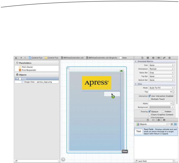
Adding the Text Fields
With your image view finished, it’s time to bring on the text fields. Grab a text field from the library, and drag it into the View, underneath the image view. Use the blue guidelines to align it with the right margin and snug it just under your image view (see Figure 4–10).
Figure 4–10. We dragged a text field out of the library and dropped it onto the view, just below our image view and touching the right blue guideline.
A horizontal blue guideline will appear just above the text field when you move it very close to the bottom of your image view. That guideline tells you when the object you are dragging is the minimum reasonable distance from an adjacent object. You can leave your text field there for now, but to give it a balanced appearance, consider moving the text field just a little farther down. Remember that you can always edit your nib file again in order to change the position and size of interface elements without needing to change code or reestablish connections.
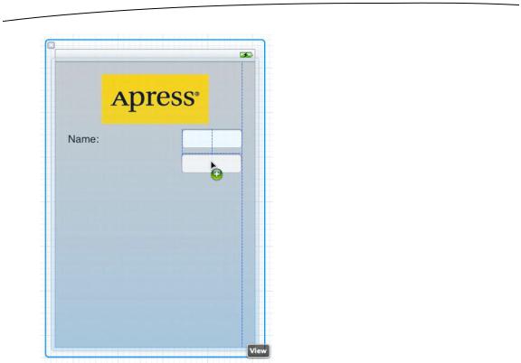
After you drop the text field, grab a label from the library, and drag that over so it is aligned with the left margin of the view and vertically with the text field you placed earlier. Notice that multiple blue guidelines will pop up as you move the label around, making it easy to align the label to the text field using the top, bottom, or middle of the
www.it-ebooks.info
CHAPTER 4: More User Interface Fun |
83 |
label. We’re going to align the label and the text field using the middle of those guidelines (see Figure 4–11).
Figure 4–11. Aligning the label and text field using the baseline guide
Double-click the label you just dropped, change it to read Name: instead of Label (note the colon character at the end of the label), and press the return key to commit your changes.
Next, drag another text field from the library to the view, and use the guidelines to place it below the first text field (see Figure 4–12).
www.it-ebooks.info
84 |
CHAPTER 4: More User Interface Fun |
Figure 4–12. Adding the second text field
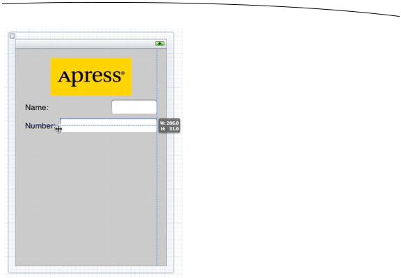
Once you’ve added the second text field, grab another label from the library, and place it on the left side, below the existing label. Again, use the middle blue guideline to align your new label with the second text field. Double-click the new label, and change it to read Number: (don’t forget the colon).
Now, let’s expand the size of the bottom text field to the left, so it snugs up against the right side of the label. Why start with the bottom text field? We want the two text fields to be the same size, and the bottom label is longer.
Single-click the bottom text field, and drag the left resize dot to the left until a blue guideline appears to tell you that you are as close as you should ever be to the label (see Figure 4–13). This particular guideline is somewhat subtle—it’s only as tall as the text field itself, so keep your eyes peeled.
www.it-ebooks.info
CHAPTER 4: More User Interface Fun |
85 |
Figure 4–13. Expanding the size of the bottom text field
Now, expand the top text field in the same way so that it matches the bottom one in size. Once again, a blue guideline provides some help, and this one is easier to spot.
We’re basically finished with the text fields except for one small detail. Look back at Figure 4–5. Do you see how the Name: and Number: are right-aligned? Right now, ours are both against the left margin. To align the right sides of the two labels, click the Name: label, hold down the shift key, and click the Number: label so both labels are selected. Now select Editor Align Right Edges.
When you are finished, the interface should look very much like the one shown in Figure 4–5. The only difference is the light-gray text in each text field. We’ll add that now.
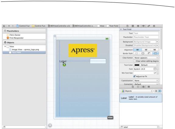
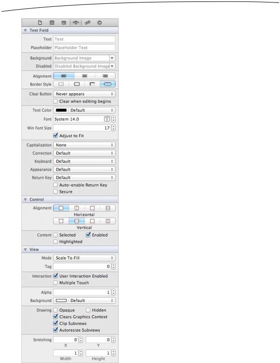
Select the top text field and press 4 to bring up the attributes inspector (see Figure 4–14). The text field is one of the most complex iOS controls, as well as one of the most commonly used. Let’s take a walk through the settings, beginning from the top of the inspector.
www.it-ebooks.info
86 |
CHAPTER 4: More User Interface Fun |
Figure 4–14. The inspector for a text field showing the default values
www.it-ebooks.info