


CHAPTER 4: More User Interface Fun |
87 |
Text Field Inspector Settings
In the first field, Text, you can set a default value for the text field. Whatever you type here will show up in the text field when your application launches.
The second field, Placeholder, allows you to specify a bit of text that will be displayed in gray inside the text field, but only when the field does not have a value. You can use a placeholder instead of a label if space is tight, or you can use it to clarify what the user should type into this text field. Type in the text Type in a name as the placeholder for our currently selected text field, and then hit return to commit the change.
The next two fields, Background and Disabled, are used only if you need to customize the appearance of your text field, which is completely unnecessary and actually illadvised the vast majority of the time. Users expect text fields to look a certain way. We’re going to skip over these fields, leaving them set to their defaults.
Below these fields are three buttons for controlling the alignment of the text displayed in the field. We’ll leave this setting at the default value of left-aligned (the leftmost button).
Next are four buttons labeled Border Style. These allow you to change the way the text field’s edge will be drawn. The default value (the rightmost button) creates the text field style that users are most accustomed to seeing for normal text fields in an iOS application. Feel free to try all four different styles. When you’re finished experimenting, set this setting back to the rightmost button.
Below the border setting is a Clear Button popup button, which lets you choose when the clear button should appear. The clear button is the small X that can appear at the right end of a text field. Clear buttons are typically used with search fields and other fields where you would be likely to change the value frequently. They are not typically included on text fields used to persist data, so leave this at the default value of Never appears.
The Clear when editing begins checkbox specifies what happens when the user touches this field. If this box is checked, any value that was previously in this field will be deleted, and the user will start with an empty field. If this box is unchecked, the previous value will remain in the field, and the user will be able to edit it. Leave this checkbox unchecked.
After that is a series of fields that let you set the font, font color, and minimum font size. We’ll leave the Text Color at the default value of black. Note that the Text Color popup is divided into two parts. The right side allows you to select from a set of preselected colors, and the left side gives you access to a color well to more precisely specify your color.
The Font setting is divided into three parts. On the right is a control that lets you increment or decrement the text size, one point at a time. The left side allows you to manually edit the font name and size. Finally, click the T-in-a-box icon to bring up a popup window that lets you set the various font attributes. We’ll leave the Font at its default setting of System 14.0.
www.it-ebooks.info

88 |
CHAPTER 4: More User Interface Fun |
Following the Font setting is a control that lets you set the minimum font size that the text field will use for displaying its text. Leave that at its default value for now.
The Adjust to Fit checkbox specifies whether the size of the text should shrink if the text field is reduced in size. Adjusting to fit will keep the entire text visible in the view, even if the text would normally be too big to fit in the allotted space. This checkbox works in conjunction with the minimum font size setting. No matter the size of the field, the text will not be resized below that minimum size. Specifying a minimum size allows you to make sure that the text doesn’t get too small to be readable.
The next section defines how the keyboard will look and behave when this text field is being used. Since we’re expecting a name, let’s change the Capitalization popup to Words. This causes every word to be automatically capitalized, which is what you typically want with names.
The next three popups—Correction, Keyboard, and Appearance—can be left at their default values. Take a minute to look at each to get a sense of what these settings do.
Next is the Return Key popup. The return key is the key on the lower right of the keyboard, and its label changes based on what you’re doing. If you are entering text into Safari’s search field, for example, then it says Search. In an application like ours, where the text fields share the screen with other controls, Done is the right choice. Make that change here.
If the Auto-enable Return Key checkbox is checked, the return key is disabled until at least one character is typed into the text field. Leave this unchecked, because we want to allow the text field to remain empty if the user prefers not to enter anything.
The Secure checkbox specifies whether the characters being typed are displayed in the text field. You would check this checkbox if the text field were being used as a password field. Leave it unchecked for our app.
The next section allows you to set control attributes inherited from UIControl, but these generally don’t apply to text fields and, with the exception of the Enabled checkbox, won’t affect the field’s appearance. We want to leave these text fields enabled so that the user can interact with them. Leave the default settings in this section.
The last section on the inspector, View, should look familiar. It’s identical to the section of the same name on the image view inspector we looked at earlier. These are attributes inherited from the UIView class, and since all controls are subclasses of UIView, they all share this section of attributes. As you did earlier for the image view, check the Opaque checkbox, and uncheck Clears Graphics Context and Clip Subviews, for the reasons we discussed earlier.
Setting the Attributes for the Second Text Field
Next, single-click the second text field in the View window, and return to the inspector. In the Placeholder field, type Type in a number, and make sure Clear When Editing Begins is unchecked. A little farther down, click the Keyboard popup menu. Since we want the user to enter only numbers, not letters, select Number Pad. This ensures that
www.it-ebooks.info
CHAPTER 4: More User Interface Fun |
89 |
the users will be presented with a keyboard containing only numbers, meaning they won’t be able to enter alphabetical characters, symbols, or anything other than numbers. We don’t need to set the Return Key value for the numeric keypad, because that style of keyboard doesn’t have a return key, so all of the other inspector settings can stay at the default values. As you did earlier, check the Opaque checkbox, and uncheck Clears Graphics Context and Clip Subviews.
Creating and Connecting Outlets
We are almost ready to take our app for its first test drive. For this first part of the interface, all that’s left is creating and connecting our outlets. The image view and labels on our interface do not need outlets because we don’t need to change them at runtime. The two text fields, however, are passive controls that hold data we’ll need to use in our code, so we need outlets pointing to each of them.
As you probably remember from the previous chapter, Xcode 4 allows us to create and connect outlets at the same time using the assistant editor. Go into the assistant editor now by selecting the middle toolbar button labeled Editor or by selecting View Assistant Editor Show Assistant Editor.
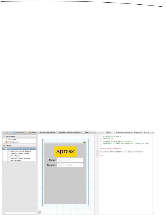
Make sure your nib file is selected in the project navigator. If you don’t have a large amount of screen real estate, you might also want to select View Utilities Hide Utilities to hide the utility pane during this step. When you bring up the assistant editor, the nib editing pane will be split in two, with Interface Builder in one half and BIDViewController.h in the other (see Figure 4–15). This new editing area—the one showing BIDViewController.h—is the assistant.
Figure 4–15. The nib editing area with the assistant turned on. You can see the assistant area on the right, showing the code from BIDViewController.h.
www.it-ebooks.info
90 |
CHAPTER 4: More User Interface Fun |
You'll see that the upper boundary of the assistant includes a jump bar, much like the normal editor pane. One important addition to the assistant's jump bar is a new set of “smart” selections, which let you switch between a variety of files that Xcode believes are relevant, based on what appears in the main view. By default, it shows a group of files labeled Top Level Objects, including your own source code for the controller class (since it's one of the top-level objects in the nib), as well as headers for UIResponder and UIView, since those are also represented at the top level of the nib. Take a few minutes to click around the jump bar at the top of the assistant, just to get a feel for what’s what. Once you have a sense of the jump bar and files represented there, move on.
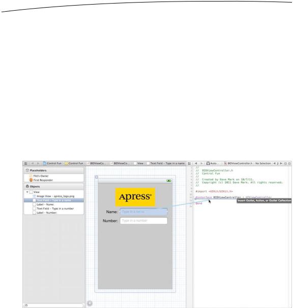
Now comes the fun part. Make sure BIDViewController.h is still showing in the assistant (use the jump bar to return there if necessary). Now control-drag from the top text field in the view over to the BIDViewController.h source code, right below the @interface line. You should see a gray popup that reads Insert Outlet, Action, or Outlet Collection (see Figure 4–16). Release the mouse button, and you’ll get the same popup you saw in the previous chapter. We want to create an outlet called nameField, so type nameField into the Name field (say that five times fast!), and then hit return.
Figure 4–16. With the assistant turned on, we control-drag over to the declaration of nameField to connect that outlet.
You now have a property called nameField in BIDViewController, and it has been connected to the top text field. Do the same for the second text field, creating and connecting it to a property called numberField.
www.it-ebooks.info