

170 |
CHAPTER 7: Tab Bars and Pickers |
By this point, you should be comfortable using delegates. We’ve already used application delegates and action sheet delegates, and the basic idea is the same here. The picker defers several jobs to its delegate. The most important of these is the task of determining what to actually draw for each of the rows in each of its components. The picker asks the delegate for either a string or a view that will be drawn at a given spot on a given component. The picker gets its data from the delegate.
In addition to the delegate, pickers need to have a data source. In this instance, the name data source is a bit of a misnomer. The data source tells the picker how many components it will be working with and how many rows make up each component. The data source works like the delegate, in that its methods are called at certain, prespecified times. Without a data source and a delegate, pickers cannot do their job; in fact, they won’t even be drawn.
It’s very common for the data source and the delegate to be the same object, and just as common for that object to be the view controller for the picker’s enclosing view, which is the approach we’ll be using in this application. The view controllers for each of our application’s content panes will be the data source and the delegate for their picker.
NOTE: Here’s a pop quiz: Is the picker data source part of the model, view, or controller portion of the application? It’s a trick question. A data source sounds like it must be part of the model, but in fact, it’s actually part of the controller. The data source isn’t usually an object designed to hold data. In simple applications, the data source might hold data, but its true job is to retrieve
data from the model and pass it along to the picker.
Let’s fire up Xcode and get to it.
Setting Up the Tab Bar Framework
Although Xcode does provide a template for tab bar applications, we’re going to build ours from scratch. It’s not much extra work, and it’s good practice.
Create a new project, select the Empty Application template again, and choose Next to go to the next screen. In the Product Name field, type Pickers. Make sure the checkbox that says Use Core Data is unchecked, and set the Device Family popup to iPhone. Then choose Next again, and Xcode will let you select the folder where you want to save your project.
We’re going to walk you through the process of building the whole application, but at any step of the way, if you feel like challenging yourself by moving ahead of us, by all means go ahead. If you get stumped, you can always come back. If you don’t feel like skipping ahead, that’s just fine. We love the company.
www.it-ebooks.info

CHAPTER 7: Tab Bars and Pickers |
171 |
Creating the Files
In the previous chapter, we created a root view controller (root controller for short) to manage the process of swapping our application’s other views. We’ll be doing that again this time, but we won’t need to create our own root view controller class. Apple provides a very good class for managing tab bar views, so we’re just going to use an instance of UITabBarController as our root controller.
First, we need to create five new classes in Xcode: the five view controllers that the root controller will swap in and out.
Expand the Pickers folder in the project navigator. There, you’ll see the source code files that Xcode created to start off the project. Single-click the Pickers folder, and press N or select File New New File….
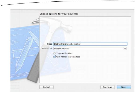
Select Cocoa Touch in the left pane of the new file assistant, and then select the icon for UIViewController subclass and click Next to continue. The next screen lets you give your new class a name. Enter BIDDatePickerViewController in the Class field. As always, when naming a new class file, carefully check your spelling. A typo here will cause your new class to be named incorrectly. You’ll also see a control that lets you select or enter a superclass for your new class, which you should leave as UIViewController. Below that, you should see a checkbox labeled With XIB for user interface (see Figure 7–7). Make sure that’s checked (and only that one; the Targeted for iPad option should be unchecked) before clicking Next.
Finally, you’ll be shown a folder selection window, which lets you choose where the class should be saved. Choose the Pickers directory, which already contains the BIDAppDelegate class and a few other files. Make sure also that the Group popup has the Pickers folder selected, and that the target checkbox for Pickers is checked.
After you click the Create button, three new files will appear in your Pickers folder:
BIDDatePickerViewController.h, BIDDatePickerViewController.m, and BIDDatePickerViewController.xib.
Repeat those steps four more times, using the names
BIDSingleComponentPickerViewController, BIDDoubleComponentPickerViewController, BIDDependentComponentPickerViewController, and BIDCustomPickerViewController. Be sure to select the Pickers folder in the project navigator each time you create your new file, so the newly created files are bunched nicely together.
www.it-ebooks.info
172 |
CHAPTER 7: Tab Bars and Pickers |
Figure 7–7. When creating a subclass of UIViewController, Xcode will create the accompanying .xib file for you if you select the With XIB for user interface checkbox.
Adding the Root View Controller
We’re going to create our root view controller, which will be an instance of UITabBarController, in Interface Builder. Before we can do that, however, we should declare an outlet for it. Single-click BIDAppDelegate.h, and add the following code to it:
#import <UIKit/UIKit.h>
@interface BIDAppDelegate : UIResponder <UIApplicationDelegate>
@property (strong, nonatomic) IBOutlet UIWindow *window;
@property (strong, nonatomic) IBOutlet UITabBarController *rootController;
@end
Before we move to Interface Builder to create our root view controller, let’s add the following code to BIDAppDelegate.m:
#import "BIDAppDelegate.h"
@implementation BIDAppDelegate
@synthesize window = _window;
@synthesize rootController;
www.it-ebooks.info

CHAPTER 7: Tab Bars and Pickers |
173 |
- (BOOL)application:(UIApplication *)application didFinishLaunchingWithOptions:(NSDictionary *)launchOptions
{
self.window = [[UIWindow alloc] initWithFrame:[[UIScreen mainScreen] bounds]]; // Override point for customization after app launch
[[NSBundle mainBundle] loadNibNamed:@"TabBarController" owner:self options:nil]; [self.window addSubview:rootController.view];
self.window.backgroundColor = [UIColor whiteColor]; [self.window makeKeyAndVisible];
return YES;
}
.
.
.
There shouldn’t be anything in this code that’s a surprise to you. We’re doing pretty much the same thing we did in the previous chapter, except that we’re using a controller class provided by Apple instead of one we wrote ourselves. This time, we’re also going to perform a new trick by loading a nib file containing the view controller, instead of creating the view controller directly in code. In the next section, we’ll create that .xib file and configure it so that when it loads, our app delegate’s rootController variable is connected to a UITabBarController, which is then ready to be inserted into our app’s window.
Tab bars use icons to represent each of the tabs, so we should also add the icons we’re going to use before editing the nib file for this class. You can find some suitable icons in the 07 Pickers/Tab Bar Icons/ folder of the project archive that accompanies this book.
Add all five of the icons in that folder to the project. You can just drag the folder from the Finder and drop it on the Pickers folder in the project navigator. When asked, select
Create groups for any added folders, and Xcode will add a Tab Bar Icons subfolder to the Pickers folder.
The icons you use should be 24 × 24 pixels and saved in .png format. The icon file should have a transparent background. Generally, medium-gray icons look the best on a tab bar. Don’t worry about trying to match the appearance of the tab bar. Just as it does with the application icon, iOS will take your image and make it look just right.
Creating TabBarController.xib
Now, let’s create the .xib file that will contain our tab bar controller. Select the Pickers folder in the project navigator, and press N to create a new file. When the standard file-creation assistant appears, select User Interface from the iOS section on the left, and then select the Empty template on the right and click Next. Leave Device Family set to iPhone on the next screen, hit Next again, and you’ll come to the final screen, where the assistant asks you to name the file. Call it TabBarController.xib, making sure to use the exact same spelling we used in the code we entered earlier—otherwise, the app won’t be able to locate and load the nib file. Make sure the Pickers directory, the Pickers
www.it-ebooks.info
174 |
CHAPTER 7: Tab Bars and Pickers |
group, and the Pickers target are selected. Those should all be selected by default, but it’s always worth double-checking.
When you’re all set, click Create. Xcode will create the file TabBarController.xib, and you’ll see it appear in the project navigator. Select it, and the familiar Interface Builder editing view will appear.
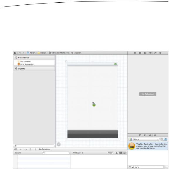
At this point, this nib file is very much a blank slate. Let’s remedy that by dragging a Tab Bar Controller from the object library (see Figure 7–8) over to the nib’s main window.
Figure 7–8. Dragging a Tab Bar Controller from the library into the nib editor
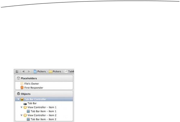
Once you drop the tab bar controller onto your nib’s main window, a new window representing the UITabBarController will appear (see Figure 7–9), and the tab bar controller icon will appear in the Interface Builder dock. If you view the dock in list mode (click the triangle in a circle icon just to the right of the bottom of the dock), you can expand the tab bar controller icon to reveal the tab bar and the two view controllers and associated items that appear by default.
www.it-ebooks.info
CHAPTER 7: Tab Bars and Pickers |
175 |
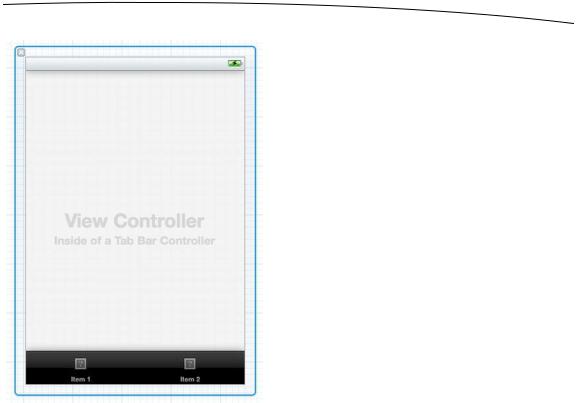
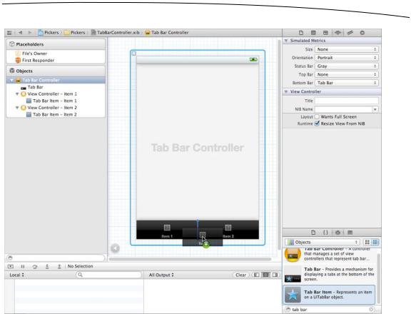
Figure 7–9. The tab bar controller’s window. Notice the tab bar at the bottom of the window, with two individual tabs. Also note the text in the view area, marking the view controller inside the tab bar controller.
This tab bar controller will be our root controller. As a reminder, the root controller controls the very first view that the user will see when your program runs. It is responsible for switching the other views in and out. Since we’ll connect each of our views to one of the tab bar tabs, the tab bar controller makes a logical choice as a root controller.
In the previous section, we added some code to the BIDAppDelegate class to load the nib we are currently creating and to use the rootController outlet to add the root controller’s view to the application window. The problem right now is that this nib file doesn’t yet know anything about the BIDAppDelegate class. It has no idea who its File’s Owner should be, so we have no way to connect things together.
Open the identity inspector, and then select File’s Owner in the dock. The identity inspector will show NSObject in the Custom Class’s Class field. We need to change NSObject to BIDAppDelegate, marking the app delegate as the File’s Owner, which will allow us to connect the rootController outlet to the new controller. Go ahead and type BIDAppDelegate or select it from the popup.
Press the enter key to make sure the new value is set, and then switch to the connections inspector, where you’ll see that File’s Owner now has an outlet named rootController, ready for connecting! There’s no time like the present, so go ahead and
www.it-ebooks.info
176 |
CHAPTER 7: Tab Bars and Pickers |
drag from the rootController outlet’s little connecting ring over to the Tab Bar Controller in the dock.
Our next step is to customize our tab bar so it reflects the five tabs shown in Figure 7–2. Each of those five tabs represents one of our five pickers.
In the nib editor, if the dock is not in list view, switch it over by clicking the triangle-in-a- circle icon just to the right of the bottom of the dock. Open the disclosure triangle to the left of Tab Bar Controller to reveal a Tab Bar and two View Controller entries. Next, open the disclosure triangles to the left of each View Controller to show the Tab Bar Item associated with each controller (see Figure 7–10). By opening up everything, you’ll have a better understanding of what’s happening as we customize this tab bar.
Figure 7–10. The tab bar controller, opened all the way to show the items nested within
Let’s add three more Tab Bar Items to the tab bar. As you’ll see, the associated View Controllers will be added automatically each time we drag over a new Tab Bar Item.
Bring up the object library ( View Utilities Show Object Library). Locate a Tab Bar Item and drag it onto the tab bar (see Figure 7–11). Notice the insertion point. This tells you where on the tab bar your new item will end up. Since we will be customizing all of our tab bar items, it doesn’t matter where this one lands.
www.it-ebooks.info
CHAPTER 7: Tab Bars and Pickers |
177 |
Figure 7–11. Dragging a Tab Bar Item from the library onto our tab bar. Notice the insertion point that shows you where your new item will end up.
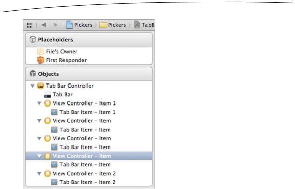
Now drag out two more Tab Bar Items, so you have a total of five. If you take a look at your dock, you’ll see that your tab bar now consists of five View Controllers, each with its own Tab Bar Item. Open the disclosure triangle to the left of each View Controller so you can see all of them (see Figure 7–12).
www.it-ebooks.info
178 |
CHAPTER 7: Tab Bars and Pickers |
Figure 7–12. The tab bar controller, opened all the way to show the five view controllers and their associated tab bar items
Our next step is to customize each of the five view controllers. In the dock, select the first View Controller, and then bring up the attributes inspector (View Utilities Show Attributes Inspector). This is where we associate each tab’s view controller with the appropriate nib.
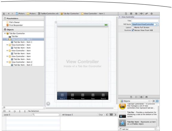
In the attributes inspector, leave the Title field blank (see Figure 7–13). Tab bar view controllers don’t use this title for anything. Specify a NIB Name of
BIDDatePickerViewController. Do not include the .xib extension.
Just below the NIB Name field, the checkbox labeled Wants Full Screen indicates that the view that comes up when you select this tab will overlap and hide the tab bar. If you check this checkbox, you must provide an alternative mechanism for navigating off that tab. We will leave this value unchecked for all of our tabs. In addition, leave the Resize View From NIB checkbox checked. Since we’ll design our views to be the size we want and to not need resizing, this last checkbox really won’t matter.
www.it-ebooks.info
CHAPTER 7: Tab Bars and Pickers |
179 |
Figure 7–13. We’ve selected the first of our five view controllers and associated the nib named BIDDatePickerViewController.xib with the controller. Note that we left off the extension .xib. This is automatically added to the nib name.
While you’re here, bring up the identity inspector for the view controller associated with the leftmost tab. In the Custom Class section of the inspector, change the class to BIDDatePickerViewController, and press return or tab to set it. You’ll see that the name of the selected control in the dock changes to Date Picker View Controller – Item 1, mirroring the change you made.
Now repeat this same process for the next four view controllers. In the attributes inspector for each, make sure the checkboxes are correctly configured, and enter the nib names BIDSingleComponentPickerViewController, BIDDoubleComponentPickerViewController, BIDDependentComponentPickerViewController, and BIDCustomPickerViewController, respectively. For each view controller, you need to make sure to make changes in two places: Use the identity inspector to set the class name, and the attributes inspector to make the same change in the NIB Name field.
You’ve just made a lot of changes. Check your work and save it. Let’s customize the five Tab Bar Items now, so they have the correct icon and label.
www.it-ebooks.info
180 CHAPTER 7: Tab Bars and Pickers
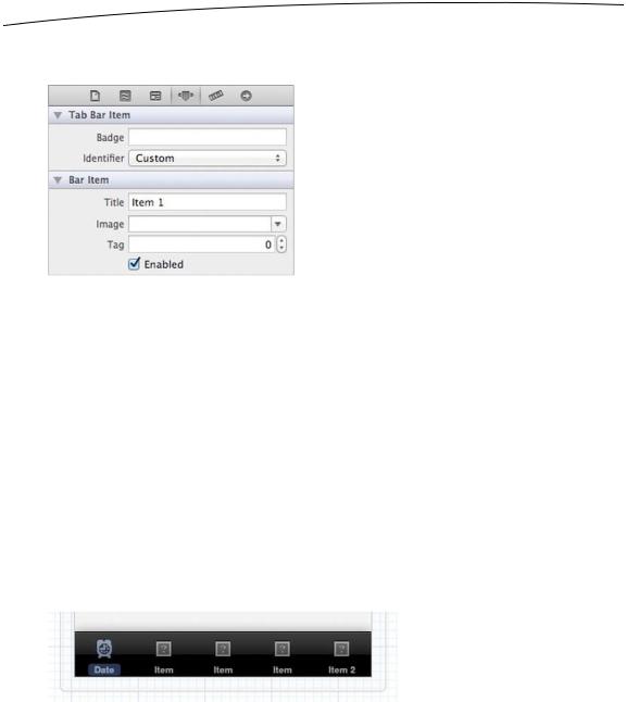
In the dock, select the Tab Bar Item that is a subitem of the Date Picker View Controller. Press 4 to return to the attributes inspector (see Figure 7–14).
Figure 7–14. The Tab Bar Item attributes inspector
The first field in the Tab Bar Item section is labeled Badge. This can be used to put a red icon onto a tab bar item, similar to the red number placed on the Mail icon that tells you how many unread e-mail messages you have. We’re not going to use the Badge field in this chapter, so you can leave it blank.
Under that, there’s a popup button called Identifier. This field allows you to select from a set of commonly used tab bar item names and icons, such as Favorites and Search. If you select one of these, the tab bar will provide the name and icon for the item based on your selection. We’re not using standard items, so leave this set to Custom.
The next two fields down are where we can specify a title and custom tab icon for a tab bar item. Change the Title from Item 1 to Date. Next, click the Image combo box, and select the clockicon.png image. If you are using your own set of icons, select one of your .png files instead. For the rest of this chapter, we’ll assume you used our resources. Adjust your thinking as necessary.
If you look over at the Tab Bar Controller window, you’ll see that the leftmost tab bar item now reads Date and has a picture of a clock on it (see Figure 7–15).
Figure 7–15. Our first tab bar item has changed to have a title of Date and an icon of a clock. Cool!
Repeat this process for the other four tab bar items:
Change the second Tab Bar Item to a Title of Single, and specify an Image of singleicon.png.
Change the third Tab Bar Item to a Title of Double, and specify an Image of doubleicon.png.
www.it-ebooks.info