- •Contents at a Glance
- •About the Authors
- •About the Technical Reviewer
- •Acknowledgments
- •Preface
- •What This Book Is
- •What You Need
- •Developer Options
- •What You Need to Know
- •What’s Different About Coding for iOS?
- •Only One Active Application
- •Only One Window
- •Limited Access
- •Limited Response Time
- •Limited Screen Size
- •Limited System Resources
- •No Garbage Collection, but…
- •Some New Stuff
- •A Different Approach
- •What’s in This Book
- •What’s New in This Update?
- •Are You Ready?
- •Setting Up Your Project in Xcode
- •The Xcode Workspace Window
- •The Toolbar
- •The Navigator View
- •The Jump Bar
- •The Utility Pane
- •Interface Builder
- •New Compiler and Debugger
- •A Closer Look at Our Project
- •Introducing Xcode’s Interface Builder
- •What’s in the Nib File?
- •The Library
- •Adding a Label to the View
- •Changing Attributes
- •Some iPhone Polish—Finishing Touches
- •Bring It on Home
- •The Model-View-Controller Paradigm
- •Creating Our Project
- •Looking at the View Controller
- •Understanding Outlets and Actions
- •Outlets
- •Actions
- •Cleaning Up the View Controller
- •Designing the User Interface
- •Adding the Buttons and Action Method
- •Adding the Label and Outlet
- •Writing the Action Method
- •Trying It Out
- •Looking at the Application Delegate
- •Bring It on Home
- •A Screen Full of Controls
- •Active, Static, and Passive Controls
- •Creating the Application
- •Implementing the Image View and Text Fields
- •Adding the Image View
- •Resizing the Image View
- •Setting View Attributes
- •The Mode Attribute
- •Interaction Checkboxes
- •The Alpha Value
- •Background
- •Drawing Checkboxes
- •Stretching
- •Adding the Text Fields
- •Text Field Inspector Settings
- •Setting the Attributes for the Second Text Field
- •Creating and Connecting Outlets
- •Closing the Keyboard
- •Closing the Keyboard When Done Is Tapped
- •Touching the Background to Close the Keyboard
- •Adding the Slider and Label
- •Creating and Connecting the Actions and Outlets
- •Implementing the Action Method
- •Adding Two Labeled Switches
- •Connecting and Creating Outlets and Actions
- •Implementing the Switch Actions
- •Adding the Button
- •Connecting and Creating the Button Outlets and Actions
- •Implementing the Segmented Control Action
- •Implementing the Action Sheet and Alert
- •Conforming to the Action Sheet Delegate Method
- •Showing the Action Sheet
- •Spiffing Up the Button
- •Using the viewDidLoad Method
- •Control States
- •Stretchable Images
- •Crossing the Finish Line
- •The Mechanics of Autorotation
- •Points, Pixels, and the Retina Display
- •Autorotation Approaches
- •Handling Rotation Using Autosize Attributes
- •Configuring Supported Orientations
- •Specifying Rotation Support
- •Designing an Interface with Autosize Attributes
- •Using the Size Inspector’s Autosize Attributes
- •Setting the Buttons’ Autosize Attributes
- •Restructuring a View When Rotated
- •Creating and Connecting Outlets
- •Moving the Buttons on Rotation
- •Swapping Views
- •Designing the Two Views
- •Implementing the Swap
- •Changing Outlet Collections
- •Rotating Out of Here
- •Common Types of Multiview Apps
- •The Architecture of a Multiview Application
- •The Root Controller
- •Anatomy of a Content View
- •Building View Switcher
- •Creating Our View Controller and Nib Files
- •Modifying the App Delegate
- •Modifying BIDSwitchViewController.h
- •Adding a View Controller
- •Building a View with a Toolbar
- •Writing the Root View Controller
- •Implementing the Content Views
- •Animating the Transition
- •Switching Off
- •The Pickers Application
- •Delegates and Data Sources
- •Setting Up the Tab Bar Framework
- •Creating the Files
- •Adding the Root View Controller
- •Creating TabBarController.xib
- •The Initial Test Run
- •Implementing the Date Picker
- •Implementing the Single-Component Picker
- •Declaring Outlets and Actions
- •Building the View
- •Implementing the Controller As a Data Source and Delegate
- •Implementing a Multicomponent Picker
- •Declaring Outlets and Actions
- •Building the View
- •Implementing the Controller
- •Implementing Dependent Components
- •Creating a Simple Game with a Custom Picker
- •Writing the Controller Header File
- •Building the View
- •Adding Image Resources
- •Implementing the Controller
- •The spin Method
- •The viewDidLoad Method
- •Final Details
- •Linking in the Audio Toolbox Framework
- •Final Spin
- •Table View Basics
- •Table Views and Table View Cells
- •Grouped and Plain Tables
- •Implementing a Simple Table
- •Designing the View
- •Writing the Controller
- •Adding an Image
- •Using Table View Cell Styles
- •Setting the Indent Level
- •Handling Row Selection
- •Changing the Font Size and Row Height
- •Customizing Table View Cells
- •Adding Subviews to the Table View Cell
- •Creating a UITableViewCell Subclass
- •Adding New Cells
- •Implementing the Controller’s Code
- •Loading a UITableViewCell from a Nib
- •Designing the Table View Cell in Interface Builder
- •Using the New Table View Cell
- •Grouped and Indexed Sections
- •Building the View
- •Importing the Data
- •Implementing the Controller
- •Adding an Index
- •Implementing a Search Bar
- •Rethinking the Design
- •A Deep Mutable Copy
- •Updating the Controller Header File
- •Modifying the View
- •Modifying the Controller Implementation
- •Copying Data from allNames
- •Implementing the Search
- •Changes to viewDidLoad
- •Changes to Data Source Methods
- •Adding a Table View Delegate Method
- •Adding Search Bar Delegate Methods
- •Adding a Magnifying Glass to the Index
- •Adding the Special Value to the Keys Array
- •Suppressing the Section Header
- •Telling the Table View What to Do
- •Putting It All on the Table
- •Navigation Controller Basics
- •Stacky Goodness
- •A Stack of Controllers
- •Nav, a Hierarchical Application in Six Parts
- •Meet the Subcontrollers
- •The Disclosure Button View
- •The Checklist View
- •The Rows Control View
- •The Movable Rows View
- •The Deletable Rows View
- •The Editable Detail View
- •The Nav Application’s Skeleton
- •Creating the Top-Level View Controller
- •Setting Up the Navigation Controller
- •Adding the Images to the Project
- •First Subcontroller: The Disclosure Button View
- •Creating the Detail View
- •Modifying the Disclosure Button Controller
- •Adding a Disclosure Button Controller Instance
- •Second Subcontroller: The Checklist
- •Creating the Checklist View
- •Adding a Checklist Controller Instance
- •Third Subcontroller: Controls on Table Rows
- •Creating the Row Controls View
- •Adding a Rows Control Controller Instance
- •Fourth Subcontroller: Movable Rows
- •Creating the Movable Row View
- •Adding a Move Me Controller Instance
- •Fifth Subcontroller: Deletable Rows
- •Creating the Deletable Rows View
- •Adding a Delete Me Controller Instance
- •Sixth Subcontroller: An Editable Detail Pane
- •Creating the Data Model Object
- •Creating the Detail View List Controller
- •Creating the Detail View Controller
- •Adding an Editable Detail View Controller Instance
- •But There’s One More Thing. . .
- •Breaking the Tape
- •Creating a Simple Storyboard
- •Dynamic Prototype Cells
- •Dynamic Table Content, Storyboard-Style
- •Editing Prototype Cells
- •Good Old Table View Data Source
- •Will It Load?
- •Static Cells
- •Going Static
- •So Long, Good Old Table View Data Source
- •You Say Segue, I Say Segue
- •Creating Segue Navigator
- •Filling the Blank Slate
- •First Transition
- •A Slightly More Useful Task List
- •Viewing Task Details
- •Make More Segues, Please
- •Passing a Task from the List
- •Handling Task Details
- •Passing Back Details
- •Making the List Receive the Details
- •If Only We Could End with a Smooth Transition
- •Split Views and Popovers
- •Creating a SplitView Project
- •The Storyboard Defines the Structure
- •The Code Defines the Functionality
- •The App Delegate
- •The Master View Controller
- •The Detail View Controller
- •Here Come the Presidents
- •Creating Your Own Popover
- •iPad Wrap-Up
- •Getting to Know Your Settings Bundle
- •The AppSettings Application
- •Creating the Project
- •Working with the Settings Bundle
- •Adding a Settings Bundle to Our Project
- •Setting Up the Property List
- •Adding a Text Field Setting
- •Adding an Application Icon
- •Adding a Secure Text Field Setting
- •Adding a Multivalue Field
- •Adding a Toggle Switch Setting
- •Adding the Slider Setting
- •Adding Icons to the Settings Bundle
- •Adding a Child Settings View
- •Reading Settings in Our Application
- •Retrieving User Settings
- •Creating the Main View
- •Updating the Main View Controller
- •Registering Default Values
- •Changing Defaults from Our Application
- •Keeping It Real
- •Beam Me Up, Scotty
- •Your Application’s Sandbox
- •Getting the Documents Directory
- •Getting the tmp Directory
- •File-Saving Strategies
- •Single-File Persistence
- •Multiple-File Persistence
- •Using Property Lists
- •Property List Serialization
- •The First Version of the Persistence Application
- •Creating the Persistence Project
- •Designing the Persistence Application View
- •Editing the Persistence Classes
- •Archiving Model Objects
- •Conforming to NSCoding
- •Implementing NSCopying
- •Archiving and Unarchiving Data Objects
- •The Archiving Application
- •Implementing the BIDFourLines Class
- •Implementing the BIDViewController Class
- •Using iOS’s Embedded SQLite3
- •Creating or Opening the Database
- •Using Bind Variables
- •The SQLite3 Application
- •Linking to the SQLite3 Library
- •Modifying the Persistence View Controller
- •Using Core Data
- •Entities and Managed Objects
- •Key-Value Coding
- •Putting It All in Context
- •Creating New Managed Objects
- •Retrieving Managed Objects
- •The Core Data Application
- •Designing the Data Model
- •Creating the Persistence View and Controller
- •Persistence Rewarded
- •Managing Document Storage with UIDocument
- •Building TinyPix
- •Creating BIDTinyPixDocument
- •Code Master
- •Initial Storyboarding
- •Creating BIDTinyPixView
- •Storyboard Detailing
- •Adding iCloud Support
- •Creating a Provisioning Profile
- •Enabling iCloud Entitlements
- •How to Query
- •Save Where?
- •Storing Preferences on iCloud
- •What We Didn’t Cover
- •Grand Central Dispatch
- •Introducing SlowWorker
- •Threading Basics
- •Units of Work
- •GCD: Low-Level Queueing
- •Becoming a Blockhead
- •Improving SlowWorker
- •Don’t Forget That Main Thread
- •Giving Some Feedback
- •Concurrent Blocks
- •Background Processing
- •Application Life Cycle
- •State-Change Notifications
- •Creating State Lab
- •Exploring Execution States
- •Making Use of Execution State Changes
- •Handling the Inactive State
- •Handling the Background State
- •Removing Resources When Entering the Background
- •Saving State When Entering the Background
- •A Brief Journey to Yesteryear
- •Back to the Background
- •Requesting More Backgrounding Time
- •Grand Central Dispatch, Over and Out
- •Two Views of a Graphical World
- •The Quartz 2D Approach to Drawing
- •Quartz 2D’s Graphics Contexts
- •The Coordinate System
- •Specifying Colors
- •A Bit of Color Theory for Your iOS Device’s Display
- •Other Color Models
- •Color Convenience Methods
- •Drawing Images in Context
- •Drawing Shapes: Polygons, Lines, and Curves
- •The QuartzFun Application
- •Setting Up the QuartzFun Application
- •Creating a Random Color
- •Defining Application Constants
- •Implementing the QuartzFunView Skeleton
- •Creating and Connecting Outlets and Actions
- •Implementing the Action Methods
- •Adding Quartz 2D Drawing Code
- •Drawing the Line
- •Drawing the Rectangle and Ellipse
- •Drawing the Image
- •Optimizing the QuartzFun Application
- •The GLFun Application
- •Setting Up the GLFun Application
- •Creating BIDGLFunView
- •Updating BIDViewController
- •Updating the Nib
- •Finishing GLFun
- •Drawing to a Close
- •Multitouch Terminology
- •The Responder Chain
- •Responding to Events
- •Forwarding an Event: Keeping the Responder Chain Alive
- •The Multitouch Architecture
- •The Four Touch Notification Methods
- •The TouchExplorer Application
- •The Swipes Application
- •Automatic Gesture Recognition
- •Implementing Multiple Swipes
- •Detecting Multiple Taps
- •Detecting Pinches
- •Defining Custom Gestures
- •The CheckPlease Application
- •The CheckPlease Touch Methods
- •Garçon? Check, Please!
- •The Location Manager
- •Setting the Desired Accuracy
- •Setting the Distance Filter
- •Starting the Location Manager
- •Using the Location Manager Wisely
- •The Location Manager Delegate
- •Getting Location Updates
- •Getting Latitude and Longitude Using CLLocation
- •Error Notifications
- •Trying Out Core Location
- •Updating Location Manager
- •Determining Distance Traveled
- •Wherever You Go, There You Are
- •Accelerometer Physics
- •Don’t Forget Rotation
- •Core Motion and the Motion Manager
- •Event-Based Motion
- •Proactive Motion Access
- •Accelerometer Results
- •Detecting Shakes
- •Baked-In Shaking
- •Shake and Break
- •Accelerometer As Directional Controller
- •Rolling Marbles
- •Writing the Ball View
- •Calculating Ball Movement
- •Rolling On
- •Using the Image Picker and UIImagePickerController
- •Implementing the Image Picker Controller Delegate
- •Road Testing the Camera and Library
- •Designing the Interface
- •Implementing the Camera View Controller
- •It’s a Snap!
- •Localization Architecture
- •Strings Files
- •What’s in a Strings File?
- •The Localized String Macro
- •Real-World iOS: Localizing Your Application
- •Setting Up LocalizeMe
- •Trying Out LocalizeMe
- •Localizing the Nib
- •Localizing an Image
- •Generating and Localizing a Strings File
- •Localizing the App Display Name
- •Auf Wiedersehen
- •Apple’s Documentation
- •Mailing Lists
- •Discussion Forums
- •Web Sites
- •Blogs
- •Conferences
- •Follow the Authors
- •Farewell
- •Index
226 |
CHAPTER 8: Introduction to Table Views |
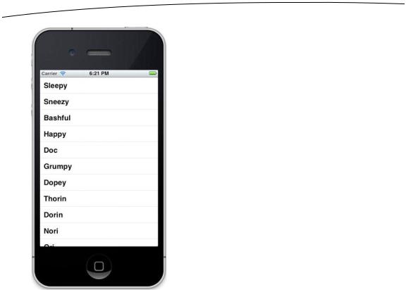
Figure 8–5. The Simple Table application, in all its dwarven glory
Adding an Image
It would be nice if we could add an image to each row. Guess we would need to create a subclass of UITableViewCell or add subviews in order to do that, huh? Actually, no, not if you can live with the image being on the left side of each row. The default table view cell can handle that situation just fine. Let’s check it out.
In the project archive, in the 08 - Simple Table folder, grab the file called star.png, and add it to your project’s Simple Table folder. star.png is a small icon we prepared just for this project.
Next, let’s get to the code. In the file BIDViewController.m, add the following code to the tableView:cellForRowAtIndexPath: method:
- (UITableViewCell *)tableView:(UITableView *)tableView cellForRowAtIndexPath:(NSIndexPath *)indexPath {
static NSString *SimpleTableIdentifier = @" SimpleTableIdentifier ";
UITableViewCell *cell = [tableView dequeueReusableCellWithIdentifier: SimpleTableIdentifier];
if (cell == nil) {
cell = [[UITableViewCell alloc]
www.it-ebooks.info
CHAPTER 8: Introduction to Table Views |
227 |
initWithStyle:UITableViewCellStyleDefault
reuseIdentifier:SimpleTableIdentifier];
}
UIImage *image = [UIImage imageNamed:@"star.png"]; cell.imageView.image = image;
NSUInteger row = [indexPath row]; cell.textLabel.text = [listData objectAtIndex:row];
return cell;
}
@end
Yep, that’s it. Each cell has an imageView property. Each imageView has an image property, as well as a highlightedImage property. The image appears to the left of the cell’s text and is replaced by the highlightedImage, if one is provided, when the cell is selected. You just set the cell’s imageView.image property to whatever image you want to display.
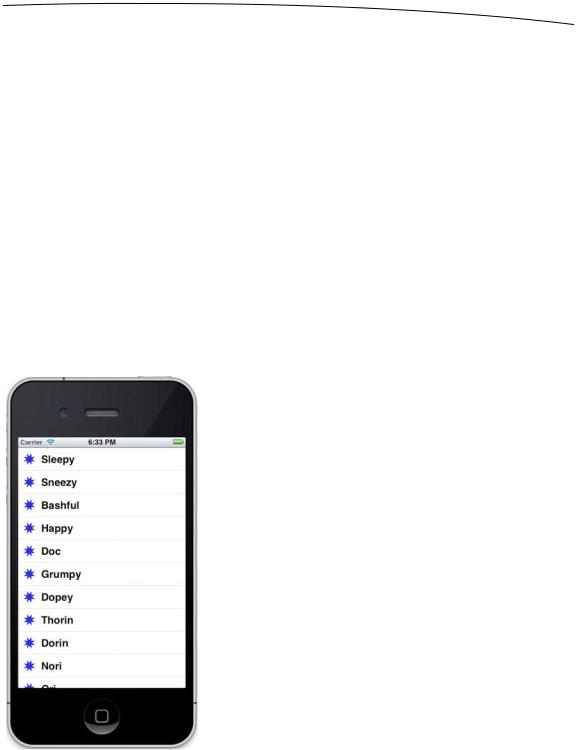
If you compile and run your application now, you should get a list with a bunch of nice little star icons to the left of each row (see Figure 8–6). Of course, we could have included a different image for each row in the table. Or, with very little effort, we could have used one icon for all of Mr. Disney’s dwarves and a different one for Mr. Tolkien’s.
Figure 8–6. We used the cell’s image property to add an image to each of the table view’s cells.
www.it-ebooks.info
228 |
CHAPTER 8: Introduction to Table Views |
If you like, make a copy of star.png, use your favorite graphics application to colorize it a bit, add it to the project, load it with imageNamed:, and use it to set imageView.highlightedImage. Now if you click a cell, your new image will be drawn. If you don’t feel like coloring, use the star2.png icon we provided in the project archive.
NOTE: UIImage uses a caching mechanism based on the file name, so it won’t load a new image property each time imageNamed: is called. Instead, it will use the already cached version.
Using Table View Cell Styles
The work you’ve done with the table view so far has made use of the default cell style shown in Figure 8–6, represented by the constant UITableViewCellStyleDefault. But the UITableViewCell class includes several other predefined cell styles that let you easily add a bit more variety to your table views. These cell styles make use of three different cell elements:
Image: If an image is part of the specified style, the image is displayed to the left of the cell’s text.
Text label: This is the cell’s primary text. In the style we used earlier, UITableViewCellStyleDefault, the text label is the only text shown in the cell.
Detail text label: This is the cell’s secondary text, usually used as an explanatory note or label.
To see what these new style additions look like, add the following code to tableView:cellForRowAtIndexPath: in BIDViewController.m:
- (UITableViewCell *)tableView:(UITableView *)tableView cellForRowAtIndexPath:(NSIndexPath *)indexPath {
static NSString *SimpleTableIdentifier = @"SimpleTableIdentifier";
UITableViewCell *cell = [tableView dequeueReusableCellWithIdentifier: SimpleTableIdentifier];
if (cell == nil) {
cell = [[UITableViewCell alloc] initWithStyle:UITableViewCellStyleDefault reuseIdentifier: SimpleTableIdentifier];
}
UIImage *image = [UIImage imageNamed:@"star.png"]; cell.imageView.image = image;
NSUInteger row = [indexPath row]; cell.textLabel.text = [listData objectAtIndex:row];
if (row < 7)
www.it-ebooks.info
CHAPTER 8: Introduction to Table Views |
229 |
cell.detailTextLabel.text = @"Mr. Disney";
else
cell.detailTextLabel.text = @"Mr. Tolkien";
return cell;
}
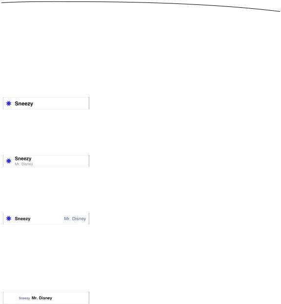
All we’ve done here is set the cell’s detail text. We use the string @"Mr. Disney" for the first seven rows and @"Mr. Tolkien" for the rest. When you run this code, each cell will look just the same as it did before (see Figure 8–7). That’s because we are using the style UITableViewCellStyleDefault, which does not make use of the detail text.
Figure 8–7. The default cell style shows the image and text label in a straight row.
Now, change UITableViewCellStyleDefault to UITableViewCellStyleSubtitle and run the app again. With the subtitle style, both text elements are shown, one below the other (see Figure 8–8).
Figure 8–8. The subtitle style shows the detail text in smaller, gray letters below the text label.
Change UITableViewCellStyleSubtitle to UITableViewCellStyleValue1, and then build and run. This style places the text label and detail text label on the same line on opposite sides of the cell (see Figure 8–9).
Figure 8–9. The style value 1 will place the text label on the left side in black letters and the detail text rightjustified on the right side in blue letters.
Finally, change UITableViewCellStyleValue1 to UITableViewCellStyleValue2. This format is often used to display information along with a descriptive label. It doesn’t show the cell’s icon, but places the detail text label to the left of the text label (see Figure 8– 10). In this layout, the detail text label acts as a label describing the type of data held in the text label.
Figure 8–10. The style value 2 does not display the image and places the detail text label in blue letters to the left of the text label.
Now that you’ve seen the cell styles that are available, go ahead and change back to using UITableViewCellStyleDefault before continuing. Later in this chapter, you’ll see how to customize the appearance of your table. But before you decide to do that, make sure you consider the available styles to see whether one of them will suit your needs.
You may have noticed that we made our controller both the data source and delegate for this table view, but up to now, we haven’t actually implemented any of the methods
www.it-ebooks.info