


CHAPTER 4: More User Interface Fun |
95 |
Figure 4–19. By changing the class of our view from UIView to UIControl, we gain the ability to trigger action methods on any of the standard events. We’ll connect the view’s Touch Down event to the backgroundTap: action.
NOTE: You might be wondering why we selected Touch Down instead of Touch Up Inside, as we did in the previous chapter. The answer is that the background isn’t a button. It’s not a control in the eyes of the user, so it wouldn’t occur to most users to try to drag their finger somewhere to
cancel the action.
Save the nib file, and then compile and run your application again. This time, the keyboard should disappear not only when the Done button is tapped, but also when you tap anywhere that’s not an active control, which is the behavior that your users will expect.
Excellent! Now that we have this section all squared away, are you ready to move onto the next group of controls?
Adding the Slider and Label
Now it’s time to add the slider and accompanying label. Remember that the value in the label will change as the slider is used. Select BIDViewController.xib in the project navigator so we can add more items to our application’s user interface.
www.it-ebooks.info
96 |
CHAPTER 4: More User Interface Fun |
Before we place the slider, let’s add a bit of breathing room to our design. The blue guidelines we used to determine the spacing between the top text field and the image above it are really suggestions for minimum proximity. In other words, the blue guidelines tell you, “Don’t get any closer than this.” Drag the two text fields and their labels down a bit, using Figure 4–1 as a guide. Now let’s add the slider.
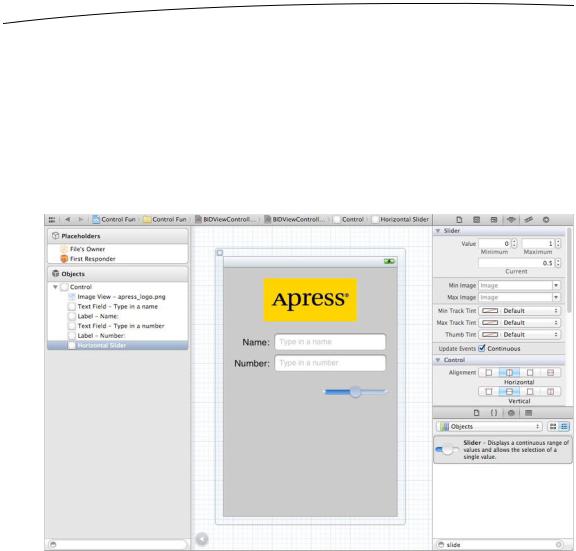
From the object library, bring over a slider and arrange it below the Number text field, using the right-side blue guideline as a stopping point, and leaving a little breathing room below the bottom text field. Our slider ended up about halfway down the view. Single-click the newly added slider to select it, and then press 4 to go back to the object attributes inspector if it’s not already visible (see Figure 4–20).
Figure 4–20. The inspector showing default attributes for a slider
A slider lets you choose a number in a given range. Use the inspector to set the
Minimum value to 1.00, the Maximum value to 100.00, and the Current value to 50.00. Leave the Update Events, Continuous checkbox checked. This ensures a continuous flow of events as the slider’s value changes. That’s all we need to worry about for now.
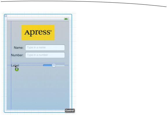
Bring over a label and place it next to the slider, using the blue guidelines to align it vertically with the slider and to align its left edge with the left margin of the view (see Figure 4–21).
www.it-ebooks.info
CHAPTER 4: More User Interface Fun |
97 |
Figure 4–21. Placing the slider’s label
Double-click the newly placed label, and change its text from Label to 100. This is the largest value that the slider can hold, and we can use that to determine the correct width of the slider. Since “100” is shorter than “Label,” we can make the label shorter. Resize the label by grabbing the right-middle resize dot and dragging to the left. Make sure you stop resizing before the text starts to get smaller. If it does start to get smaller, bring the resize dot back to the right until it returns to its original size. You can also automatically size the label to fit the text, as we discussed earlier, by pressing = or by selecting
Editor Size to Fit Content.
Next, resize the slider by single-clicking the slider to select it and dragging the left resize dot to the left until the blue guidelines indicate that you should stop.
Now, double-click the label again, and change its value to 50. That is the starting value of the slider, and we need to change it back to make sure that the interface looks correct at launch time. Once the slider is used, the code we just wrote will make sure the label continues to show the correct value.
Creating and Connecting the Actions and Outlets
All that’s left to do with these two controls is to connect the outlet and action. We need an outlet that points to the label so that we can update the label’s value when the slider is used, and we’re going to need an action method for the slider to call as it’s changed.
www.it-ebooks.info

98 |
CHAPTER 4: More User Interface Fun |
Make sure you’re using the assistant editor and editing BIDViewController.h, and then control-drag from the slider to just above the @end declaration in the assistant editor. When the popup window appears, change the Connection popup menu to Action, and then type sliderChanged in the name field. Hit return to create and connect the action.
Next, control-drag from the newly added label over to the assistant editor. This time, drag to just below the last property and above the first action method. When the popup comes up, type sliderLabel into the Name text field, and then hit return to create and connect the outlet.
Implementing the Action Method
Though Xcode has created and connected our action method, it’s still up to us to actually write the code that makes up the action method so it does what it’s supposed to do. Save the nib, then in the project navigator, single-click BIDViewController.m and look for the sliderChanged: method, which should be empty. Add the following code to that method:
-(IBAction)sliderChanged:(id)sender {
UISlider *slider = (UISlider *)sender;
int progressAsInt = (int)roundf(slider.value);
sliderLabel.text = [NSString stringWithFormat:@"%d", progressAsInt];
}
The first line in the method assigns sender to a UISlider pointer so that the compiler will let us use UISlider methods and properties without warnings. We then retrieve the current value of the slider, round it down to the nearest integer, and assign it to an integer variable. The last line of code creates a string containing that number and assigns it to the label.
Save the file. Next, press R to build and launch your app in the iPhone simulator, and try out the slider. As you move it, you should see the label’s text change in real time. Another piece falls into place. Now, let’s look at implementing the switches.
Implementing the Switches, Button, and Segmented
Control
Back to Xcode we go once again. Getting dizzy yet? This back and forth may seem a bit strange, but it’s fairly common to bounce around between source code and nib files in Xcode, and testing your app in the iOS simulator while you’re developing.
Our application will have two switches, which are small controls that can have only two states: on and off. We’ll also add a segmented control to hide and show the switches. Along with that control, we’ll add a button that is revealed when the segmented control’s right side is tapped. Let’s implement those next.
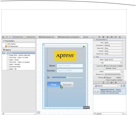
Back in the nib file, drag a segmented control from the object library (see Figure 4–22) and place it on the View window, a little below the slider.
www.it-ebooks.info
CHAPTER 4: More User Interface Fun |
99 |
TIP: To give you a sense of the spacing we’re going for, take a look at the image view with the Apress logo. We tried to leave about the same amount of space above the image view as below the image view. We did the same thing with the slider: we tried to leave about the same amount of space above the slide as below. Just a suggestion from the boyeez.
Figure 4–22. Dragging a segmented control from the library to the left side of the parent view. Next, we’ll resize the segmented control so it stretches to the right side of the view.
Expand the width of the segmented control so that it stretches from the view’s left margin to its right margin. Double-click the word First on the segmented control and change the title from First to Switches. After doing that, repeat the process with the Second segment, renaming it Button (see Figure 4–23).
www.it-ebooks.info