

42 |
Part I Learning the Max Interface |
Using the Viewports
The four viewports make up the largest area of the entire interface and provide a way of viewing the objects within the scene. Each of the viewports is configurable and can be unique from the others.
Cross- Understanding how to work with the viewports is vital to accomplishing tasks with Max, so Reference viewports have an entire chapter dedicated just to them — Chapter 2, “Seeing It All — Working
with the Viewports.”
Using the Command Panel
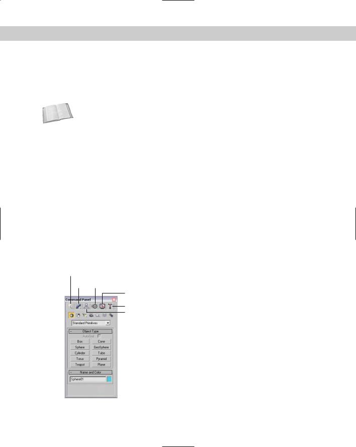
If there is one place in Max, besides the viewports, where you’ll spend all your time, it’s the Command Panel (at least until you’re comfortable enough with the quadmenus). The Command Panel is located to the right of the viewports along the right edge of the interface. This is where the object parameters, settings, and controls are located. The Command Panel is split into six panels, each accessed via a tab icon located at its top. These six tabs are Create, Modify, Hierarchy, Motion, Display, and Utilities.
You can pull away the Command Panel from the right window edge as a floating dialog box, as shown in Figure 1-5, by clicking on the open space to the right of the tabbed icons at the top of the Command Panel and dragging away from the interface edge. You can also dock it to the left window edge, which is really handy if you’re left-handed. While it’s a floating panel, you can resize the Command Panel by dragging on its edges or corners.
After you’ve pulled it away from the interface, you can re-dock it to its last position by dou- ble-clicking on its title bar. You can also right-click on the title bar to access the pop-up menu to Dock (either Left or Right), Float, Customize, or hide the Command Panel.
Create
Modify Motion
Display
Utilities
Hierarchy
Figure 1-5: The Command Panel includes six separate panels accessed via tab icons.
Chapter 1 Finding Your Way — Exploring the Max Interface |
43 |
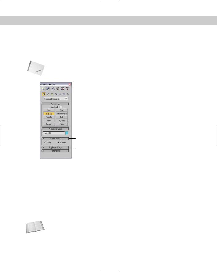
Most of the controls, buttons, and parameters in the Command Panel are contained within sections called rollouts. A rollout is a grouping of controls positioned under a gray, boxed title, as shown in Figure 1-6. Each rollout title bar includes a plus or minus sign (a minus sign indicates that the rollout is open; a plus sign shows closed rollouts). Clicking the rollout title opens or closes the rollout. You can also reposition the order of the rollouts by dragging the rollout title and dropping it above or below the other rollouts.
Note |
You cannot reposition some of the rollouts, such as the Object Type and the Name and Color |
|
rollouts found in the Create panel. |
Opened rollout
Closed rollout
Figure 1-6: Open and close rollouts by clicking on the rollout title.
Right-clicking away from the buttons in a rollout presents a pop-up menu where you can select to close the rollout you’ve clicked in, Close All, Open All, or Reset Rollout Order. The pop-up menu also lists all available rollouts within the current panel with a check mark next to the ones that are open.
Expanding all the rollouts often exceeds the screen space allotted to the Command Panel. If the rollouts exceed the given space, then a small vertical scroll bar appears at the right edge of the Command Panel. You can drag this scroll bar to access the rollouts at the bottom of the Command Panel, or you can click away from the controls when a hand cursor appears. With the hand cursor, click and drag in either direction to scroll the Command Panel. You can also scroll the Command Panel with the scroll wheel.
Cross- |
You can customize the Command Panel like the other toolbars. Customizing the Command |
Reference |
Panel is covered in Chapter 4, “Customizing the Max Interface and Setting Preferences.” |
|
The Command Panel can also be doubled or tripled (or any multiple as long as you have room) in width by dragging its left edge toward the center of the interface. The width of the Command Panel is increased at the expense of the viewports. Figure 1-7 shows the Command Panel double its normal size.
44 |
Part I Learning the Max Interface |
Figure 1-7: Increase the width of the Command Panel by dragging its left edge.
Tutorial: Rearranging the interface for lefties
I used to work for a company that required that all computers have the mouse to the left of the keyboard. We swapped computers often, and the boss felt that this would enable us to work the mouse and the keypad at the same time (and you thought your work environment was weird). The reality is that some people like it on the left and others prefer it on the right, and Max can accommodate both.
With the Command Panel on the right side of the interface, the default Max interface obviously favors right-handers, but with the docking panels, you can quickly change it to be friendly to lefties.
To rearrange the interface to make it friendly for lefties, follow these steps:
1.Click the Command Panel on the empty space to the right of the Utilities tab, and drag toward the center of the interface. As you drag the Command Panel away from the right edge, the cursor changes.
2.Continue to drag the Command Panel to the left edge, and the cursor changes again to indicate that it will be docked when released. Release the mouse button, and the Command Panel docks to the left side.
Chapter 1 Finding Your Way — Exploring the Max Interface |
45 |
3.For an even easier method, you can right-click on the Command Panel’s title bar and select Dock Left from the pop-up menu.
4.Next dock the reactor toolbar on the right side by dragging it from the left to the right. Figure 1-8 shows the rearranged interface ready for all you southpaws.
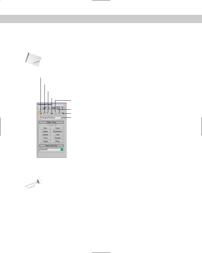
Create panel
The Create panel is the place you go to create objects for the scene. These objects could be geometric objects like spheres, cones, and boxes or other objects like lights, cameras, or Space Warps. The Create panel contains a huge variety of objects. To create an object, you simply need to find the button for the object that you want to create, click it, click in one of the viewports, and voilá — instant object.
Cross- |
Creating objects is covered in detail in chapters throughout the rest of the book, but the first |
Reference |
chapter that really gets into creating objects is Chapter 5, “Creating and Editing Primitive |
|
|
|
Objects.” You can buzz over to that chapter if you are anxious to start creating things. |
Figure 1-8: Left-handed users can move the Command Panel to the left side.
46 |
Part I Learning the Max Interface |
The Create panel includes several categories and subcategories of objects. The categories, shown in Figure 1-9, are displayed as icons directly under the Command Panel tabs. The categories include Geometry, Shapes, Lights, Cameras, Helpers, Space Warps, and Systems. Subcategories are displayed in the drop-down list under the category icons. Each subcategory displays a different set of buttons in the Object Type rollout when selected.
Note Selecting an object from the Create menu automatically opens the Create panel and selects the requested object type.
Geometry
Shapes
Lights
Cameras
Helpers
Space Warps Systems Sub-category drop-down list
Figure 1-9: The Create panel includes seven different categories of objects.
Table 1-5 lists all the available Create panel buttons for each category and subcategory.
New |
Many new items were added to the Create panel including the BlobMesh compound object |
Feature |
and all the AEC Objects such as Foliage, Railing, Wall, Doors, Windows, and Stairs. Other new |
|
|
|
features include the mental ray Area Omni and Area Spot lights, the Assembly Heads, Particle |
|
Flow, reactor Helper subcategories, and the reactor and Particles & Dynamics Space Warps |
|
subcategories. |
Chapter 1 Finding Your Way — Exploring the Max Interface |
47 |
Table 1-5: Command Panel Buttons per Subcategory
|
Subcategory |
|
Category (icon) |
(drop-down list) |
Available Buttons |
|
|
|
|
Standard Primitives |
Box, Cone, Sphere, GeoSphere, Cylinder, |
|
|
Tube, Torus, Pyramid, Teapot, Plane |
Geometry |
|
|
|
Extended Primitives |
Hedra, Torus Knot, ChamferBox, ChamferCyl, |
|
|
OilTank, Capsule, Spindle, L-Ext, Gengon, C- |
|
|
Ext, RingWave, Hose, Prism |
|
Compound Objects |
Morph, Scatter, Conform, Connect, BlobMesh, |
|
|
ShapeMerge, Boolean, Terrain, Loft, Mesher |
|
Particle Systems |
PF Source, Spray, Snow, Blizzard, PArray, |
|
|
PCloud, Super Spray |
|
Patch Grids |
Quad Patch, Tri Patch |
|
NURBS Surfaces |
Point Surf, CV Surf |
|
AEC Extended |
Foliage, Railing, Wall |
|
Dynamics Objects |
Damper, Spring |
|
Stairs |
Straight Stair |
|
Doors |
Pivot, Sliding, BiFold |
|
Windows |
Awning, Casement, Fixed, Pivoted, Projected, |
|
|
Sliding |
|
Splines |
Line, Rectangle, Circle, Ellipse, Arc, Donut, |
|
|
NGon, Star, Text, Helix, Section |
Shapes |
|
|
|
NURBS Curves |
Point Curve, CV Curve |
|
Standard |
Target Spot, Free Spot, Target Direct, |
|
|
Free Direct, Omni, Skylight, mr Area Omni, |
Lights |
|
mr Area Spot |
|
Photometric |
Target Point, Free Point, Target Linear, Free |
|
|
Linear, Target Area, Free Area, IES Sun, IES Sky |
|
Standard |
Target, Free |
Cameras |
|
|
|
Standard |
Dummy, Grid, Point, Tape, Protractor, |
|
|
Compass |
Helpers |
|
|
|
Atmospheric Apparatus |
BoxGizmo, SphereGizmo, CylGizmo |
|
Camera Match |
CamPoint |
|
Assembly Heads |
Luminaire |
Continued
48 |
Part I Learning the Max Interface |
Table 1-5 (continued)
|
Subcategory |
|
Category (icon) |
(drop-down list) |
Available Buttons |
|
|
|
|
Manipulators |
Cone Angle, Plane Angle, Slider |
|
Particle Flow |
SpeedByIcon, Find Target |
|
VRML97 |
Anchor, AudioClip, Background, Billboard, |
|
|
Fog, Inline, LOD, NavInfo, ProxSensor, Sound, |
|
|
TimeSensor, TouchSensor |
|
reactor |
RBCollection, Csolver, Point-Point, Point-Path, |
|
|
Hinge, Ragdoll, Carwheel, Prismatic, L |
|
|
Dashpot, A Dashpot, CLCollection, |
|
|
DMCollection, RPCollection, SBCollection, |
|
|
Fracture, Motor, Plane, Spring, Toy Car, Wind |
|
Forces |
Motor, Push, Vortex, Drag, Path Follow, |
|
|
PBomb, Displace, Gravity, Wind |
Space Warps |
|
|
|
Deflectors |
PDynaFlect, POmniFlect, SDynaFlect, |
|
|
SOmniFlect, UDynaFlect, UOmniFlect, |
|
|
SDeflector, UDeflector, Deflector |
|
Geometric/Deformable |
FFD (Box), FFD (Cyl), Wave, Ripple, Displace, |
|
|
Conform, Bomb |
|
Modifier-Based |
Bend, Noise, Skew, Taper, Twist, Stretch |
|
reactor |
Water |
|
Standard |
Bones, Ring Array, Sunlight, Daylight |
Systems |
|
|
|
|
|
Note For the most part, the Create panel and the Create menu are the same, but there are a couple of differences. The biggest difference is the order of many of the items. In addition, the Extended Primitives Gengon object was left out of the Create menu. Oops.
Below the Object Type rollout is the Name and Color rollout. Every object created with the Create panel is given a default name and color. Using this rollout, you can change the object name and color. The color is used to display the object in the viewports if no material is applied. Both the Object Type and Name and Color rollouts are visible in all the categories found in the Create panel.
After you select a button, the button is highlighted yellow and several additional rollouts magically appear. These new rollouts hold the parameters for the selected object and are displayed in the Create panel below the Name and Color rollout. Altering these parameters changes the object. The button remains selected, allowing you to create more objects until you select a different button, click on a toolbar button, or right-click in the active viewport.
Chapter 1 Finding Your Way — Exploring the Max Interface |
49 |
Modify panel
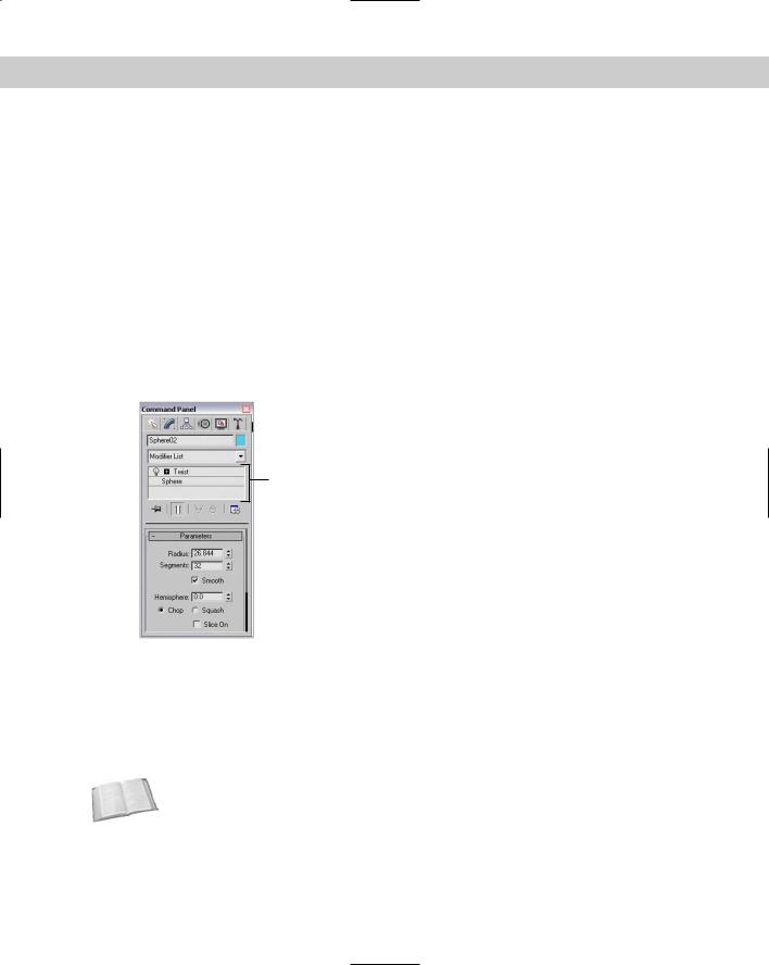
The parameters found in the Create panel are great for changing an object, but they are available only while you’re creating the object. If you select another object and then return to the Create panel with the first object selected, all its parameters are gone. Actually, they aren’t gone, but rather they’ve migrated to the Modify panel. The Modify panel is the permanent location of object parameters.
In addition to modifying object parameters, you can use the Modify panel to apply modifiers to the selected object. Modifiers are parameter-driven functions for modifying an object. You can see a complete list of modifiers in the Modifier List drop-down list (or in the Modifiers menu).
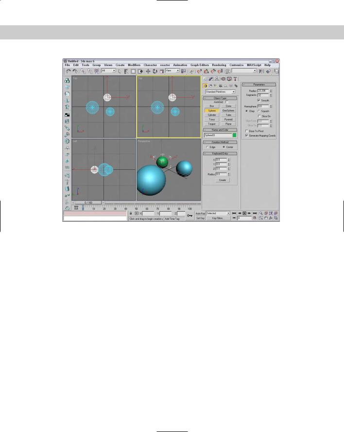
Once applied, you can control the modifiers via parameters displayed in the Modify panel. All modifiers that are applied to an object are displayed in the Modifier Stack (like the Twist modifier applied to a sphere object in Figure 1-10), which appears at the top of the Modify panel (directly under the Modifier List drop-down list). You can also apply modifiers using the Modifiers menu.
Modifier Stack
Figure 1-10: Use the Modify panel to apply modifiers and to modify object parameters.
The Modifier Stack is like an object’s medical history: It details everything that has happened to an object. The Modifier Stack displays all modifiers that have been applied to the current selected object. This stack lets you revisit any modifier and change its parameters, reorder it in the stack, or delete it.
Cross-
Reference
An introduction to modifiers is presented in Chapter 11, “Introducing Modifiers for Basic Object Deformation,” but you can find coverage of other modifiers sprinkled throughout the rest of the chapters. For example, see Chapter 24, “Working with Cameras,” for coverage of the Camera Correction modifier.
50 |
Part I Learning the Max Interface |
Hierarchy panel
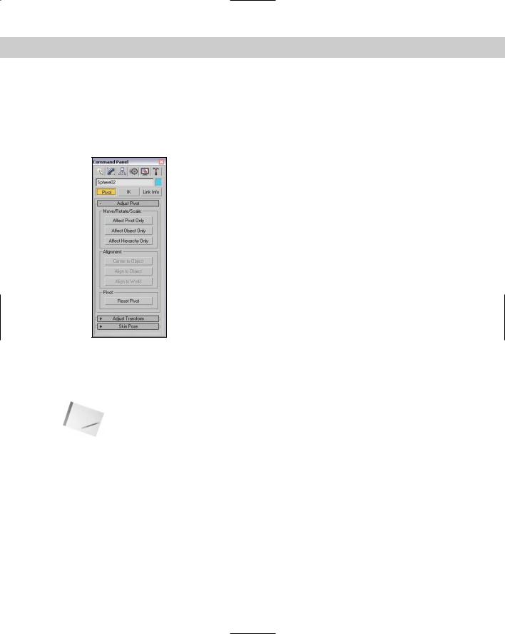
The Hierarchy panel, shown in Figure 1-11, includes three different sets of controls. You access them by using the three buttons located at the top of the panel. These sets are Pivot, Inverse Kinematics (IK), and Link Info. Each of these buttons when selected presents several different rollouts of parameters.
Figure 1-11: The Hierarchy panel offers controls for adjusting pivot points, among other things.
The Pivot button opens rollouts that let you move and reorient an object’s pivot point. A pivot point is the point about which transformations are applied. The IK button opens rollouts that let you set up an inverse kinematics structure and to define how the joints of such a structure can move. Finally, the Link Info button opens rollouts for setting locks, which prevent an object from moving, rotating, or scaling along certain axes.
Note |
Check out the details on pivots in Chapter 10, “Transforming Objects — Translate, Rotate, and |
|
Scale,” Inverse Kinematics in Chapter 37, “Using Inverse Kinematics,” and links in Chapter 8, |
|
“Grouping and Linking Objects.” |
Motion panel
Similar to the Hierarchy panel, the Motion panel has a dual personality. The two buttons at the top of the Motion panel, shown in Figure 1-12, are Parameters and Trajectories. One common way of modifying object motion is to apply Controllers and Constraints. The Parameters button opens several rollouts that enable you to apply animation Controllers and Constraints.

Chapter 1 Finding Your Way — Exploring the Max Interface |
51 |
Controllers affect the position, rotation, and scaling of objects in preset ways, and Constraints limit the motion of an object. You can access a list of Controllers by clicking the Assign Controller button positioned at the top of the Assign Controller rollout or by choosing one from the Animation menu.
Assign Controller button
Figure 1-12: The Motion panel offers an interface for assigning animation Controllers to an object.
The Trajectories button opens a single rollout that lets you set parameters for the animation path.
Cross- |
Constraints and Controllers are the subjects of Chapter 31, “Animating with Constraints and |
Reference |
Controllers.” Trajectories are covered in Chapter 30, “Animation Basics.” |
|
Display panel
The Display panel, shown in Figure 1-13, controls how objects are seen within the viewports. You can set display parameters for individual objects. Using this panel, you can hide or freeze objects and modify all display parameters. Many of these same commands are found in the Display Floater and in the Object Properties dialog box.
Cross- |
I cover the Display panel in Chapter 6, “Selecting Objects and Setting Object Properties.” |
Reference |
|
52 |
Part I Learning the Max Interface |
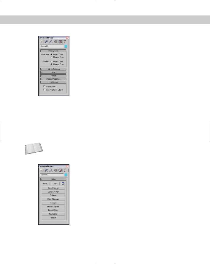
Figure 1-13: The Display panel includes settings for the color of the object.
Utilities panel
You can find an assortment of miscellaneous tools in the Utilities panel, shown in Figure 1-14. The default utilities include the Asset Browser, Camera Match, Collapse, Color Clipboard, Measure, Motion Capture, Reset XForm, MAXScript, and reactor. Click the More button at the top of the Utilities panels to open an additional list of utilities. To execute a utility, simply click its button or select it from the list. Some utilities open dialog boxes, and others present rollouts in the bottom of the Utilities panel. The button for the selected utility is highlighted in yellow.
Cross-
Reference
This panel also includes the Configure Button Sets button for customizing which buttons appear in the default Utilities rollout. See Chapter 4, “Customizing the Max Interface and Setting Preferences,” for more information.
Figure 1-14: The Utilities panel includes several miscellaneous tools.