

Chapter 1 Finding Your Way — Exploring the Max Interface |
53 |
Using the Lower Interface Bar Controls
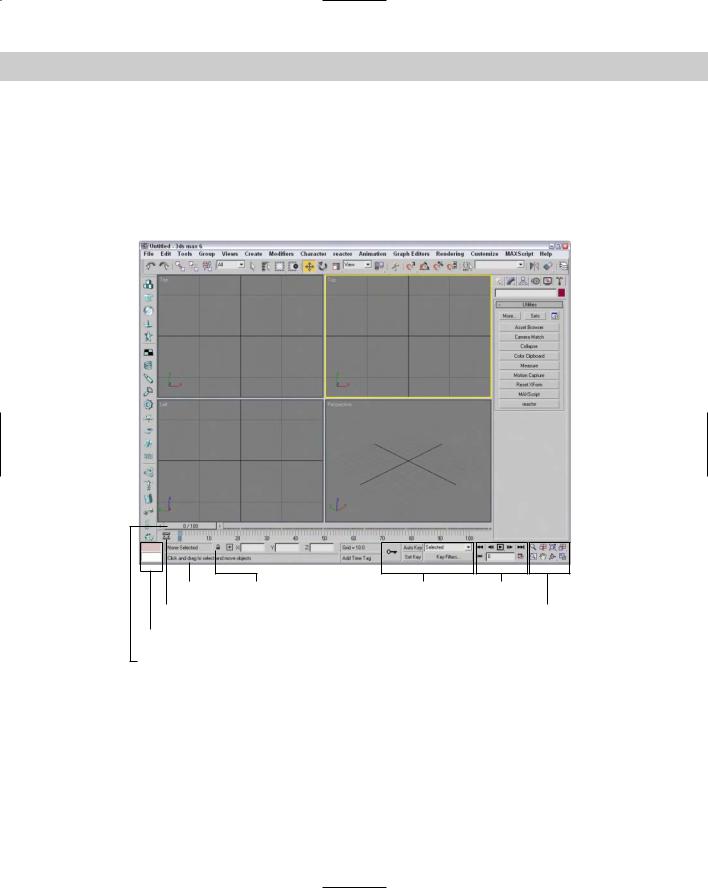
The last major interface element isn’t really an interface element, but just a collection of several different sets of controls located along the bottom edge of the interface window. These controls cannot be pulled away from the interface like the main toolbar, but you can hide them using Expert Mode (Ctrl+X). These controls, shown in Figure 1-15, include the following from left to right:
Prompt Line Status Bar |
Key Controls |
Time Controls |
Track Bar |
Viewport Navigation Controls |
|
MAXScript Mini-Listener
Time Slider
Figure 1-15: The Lower Interface Bar includes several sets of controls.
Time Slider and Track Bar: The Time Slider, located under the viewports, enables you to quickly locate a specific frame. The Track Bar displays all animation keys on a scale of frames.
Status Bar and Prompt Line: The Status Bar is below the Track Bar. It displays information on the selected objects and includes some buttons. It also includes the Transform Type-In fields. The Prompt Line is text located at the bottom of the window. It offers information about the scene and describes what Max expects you to do next.
54 |
Part I Learning the Max Interface |
MAXScript Mini-Listener: This displays MAXScript commands as they are executed. You can open and close this control by dragging its left edge.
Key Controls: These controls are for creating animation keys and include two different modes — Auto Key and Set Key.
Time Controls: Resembling the controls on an audio or video device, the Time Controls offer an easy way to move through the various animation frames and keys.
Viewport Navigation Controls: In the lower-right corner of the interface are the controls for manipulating the viewports.
Accessing frames and keys with the
Time Slider and the Track Bar
Directly beneath the viewports is a slider control known as the Time Slider. It spans the number of frames included in the current animation. Dragging the Time Slider can move you quickly between frames. The arrows surrounding the slider select the previous or next frame.
The Track Bar, positioned under the Time Slider, displays animation keys as color-coded rectangles with red for positional keys, green for rotational keys, and blue for scale keys. Parameter change keys are denoted by gray rectangles. You can hide the Track Bar with the Customize Show UI Show Track Bar menu command. Using the Track Bar, you can select, move, and delete keys.
At the left end of the Track Bar is the Open Mini Curve Editor button that you can use to expand the Track Bar to show function curves.
Cross- |
See Chapter 30, “Animation Basics,” for more information on the Track Bar. More information |
Reference |
on the Curve Editor can be found in Chapter 33, “Working with the Track View.” |
|
Learning from the Status Bar and the Prompt Line
As you work, the Status Bar provides valuable information, such as the number and type of objects selected, transformation values, and grid size. The Status Bar has two buttons — the Selection Lock Toggle button (keyboard shortcut, space) and the Absolute/Offset Mode Transform Type-In toggle button. Clicking the Selection Lock Toggle button prevents the selection of any additional objects. The button is yellow when selected.
The Transform Type-In fields display the world coordinates of the cursor in the active viewport, unless an object is selected. For the selected object, these fields show the absolute world coordinate values if the Absolute Mode Transform Type-In toggle button is selected. If the Offset mode is selected, then the fields show the offset values as the object is transformed. The values that are displayed depend on the type of transformation that is taking place (units for moves, degrees for rotation, and percentages for scaling). You can also enter values into these fields to transform the object.
The Prompt Line is directly below the Status Bar. If you’re stuck as to what to do next, look at the Prompt Line for information on what Max expects. To the right of the Prompt Line is a field marked Add Time Tag. Click this field to pop up a menu with options to Add or Edit a Time Tag. You can set Time Tags for each frame in the scene. Once set, the Time Tags are visible in the Time Tag field whenever you select that time.

Chapter 1 Finding Your Way — Exploring the Max Interface |
55 |
Controlling the MAXScript Mini-Listener
The MAXScript Mini-Listener consists of two simple text areas where you can enter MAXScript commands and immediately see the results. The pink area is where MAXScript commands are entered, and the white area is where the results are displayed. You can think of the MAXScript Mini-Listener as a calculator that is at your fingertips.
Cross- |
MAXScript and the MAXScript Mini-Listener are covered in detail in Chapter 48, “Automating |
Reference |
with MAXScript.” |
|
Using the Key Controls
You can use the Key Controls to set animation keyframes for objects in the scene. Setting keys can be done in two modes — Auto Key (keyboard shortcut, N) or Set Key (keyboard shortcut, '). Auto Key mode sets keys for any changes made to the scene objects. Set Key mode gives you more precise control and sets keys for the selected filters only when you click the Set Keys button (keyboard shortcut, K). You can set keys for the selected object or for a specified character.
Using the Time Controls
Although the Time Controls sound like an interface to a time machine, you use them to control animation sequences.
Based on the selected mode (keys or frames), the Time Controls can move between the first, previous, next, or last frames or keys. You can also reset the number of frames and the frame rate using the Time Configuration dialog box.
Cross- |
Chapter 30, “Animation Basics,” covers both the Key Controls and the Time Controls in detail. |
Reference |
|
Using the Viewport Navigation Controls
The Viewport Navigation Controls are the eight buttons located in the lower-right corner of the interface. They enable you to zoom, pan, and rotate the active viewport’s view. You can undo any viewport changes with the Views Undo Viewport Change (Shift+Z) menu command.
Cross- |
I cover the Viewport Navigation Controls in detail in Chapter 2, “Seeing It All — Working with |
Reference |
Viewports.” |
|
Interacting with the Interface
Knowing where all the interface elements are located is only the start. Max includes several interactive features that make the interface work. Learning these features makes a difference between an interface that works for you and one that doesn’t.
56 |
Part I Learning the Max Interface |
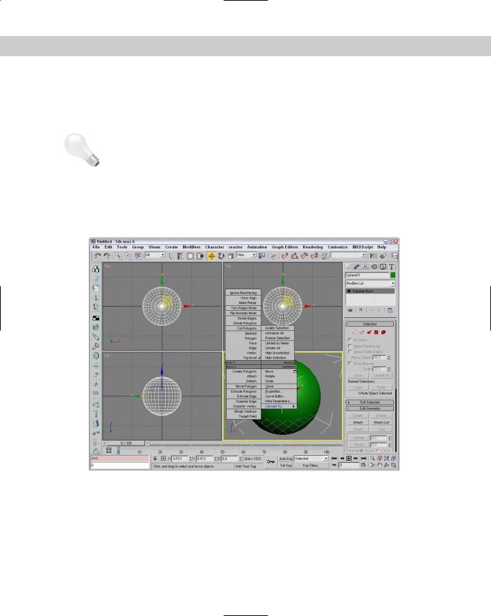
Gaining quick access with the right-click quadmenus
Quadmenus are pop-up menus with up to four separate sections that surround the cursor, as shown in Figure 1-16. Right-clicking in the active viewport opens these quadmenus. The contents of the menus depend on the object selected.
Tip Many of the real pros use quadmenus extensively. One of the reasons they do is because they can access the commands from the mouse’s current location using a couple of clicks without having to go all the way to the Command Panel to click a button.
Clicking with the left mouse button away from the quadmenu closes the quadmenu. For each menu, the last menu item selected is displayed in blue. To quickly access the blue menu item again, simply click the gray-shaded bar. Using Customize Customize User Interface, you can specify which commands appear on the quadmenus, but the default options have just about everything you need.
Figure 1-16: Quadmenus contain a host of commands in an easily accessible location.
Understanding the button color cues
Max’s interface uses color cues to help remind you of the current mode. When a button is yellow, it warns that it has control of the interface. For example, if one of the select buttons is selected, it turns yellow and any dragging in the viewport affects the object; however, if one of the Viewport Navigation Control buttons is selected, it turns yellow and dragging the viewport changes the view. Knowing what the current mode is at all times can keep you out of trouble.
Chapter 1 Finding Your Way — Exploring the Max Interface |
57 |
Tip |
|
Right-clicking in the active viewport exits any mode that has control and returns control to |
|
|
the Select Object mode. Right-clicking in one of the inactive viewports keeps the focus |
|
|
where it is and makes that clicked viewport active. |
|
Another common color is red. When the Auto Keys or Set Keys buttons are depressed, they |
|
|
turn red. The edge of the active viewport being animated also turns red. This reminds you |
|
|
that any modifications will be saved as a key. |
|
|
Toggle buttons are buttons that can be turned on or off. Example toggle buttons include the |
|
|
Snap buttons. When a toggle button is enabled, it also turns yellow. Toggle buttons high- |
|
|
lighted in blue are non-exclusive, but they notify you of a mode that is enabled, such as the |
|
|
Key Mode Toggle or the Affect Pivot Only button. |
|
Cross- |
|
All interface colors can be customized using the Customize User Interface dialog box that is |
Reference |
discussed in Chapter 4, “Customizing the Max Interface and Setting Preferences.” |
|
|
|
|
Using drag-and-drop features
Dialog boxes that work with files benefit greatly from Max’s drag-and-drop features. The Material Editor, Background Image, View File, and Environmental Settings dialog boxes all use drag and drop. These dialog boxes let you select a file or a material and drag it on top of where you want to apply it. For example, with the Maps rollout in the Material Editor open, you can drag a texture image filename from Windows Explorer or the Asset Manager and drop it on the Map button. You can even drag and drop Max files into the Max interface to open them.
Controlling spinners
Spinners are those little controls throughout the interface with a value field and two small arrows to its right. As you would expect, clicking the up arrow increases the value and clicking the down arrow decreases the value. The amount of the increase or decrease depends on the setting in the General tab of the Preference Settings dialog box. Right-clicking on the spinner resets the value to its lowest acceptable value. Another way to control the spinner value is to click the arrows and drag with the mouse. Dragging up increases the value and dragging down decreases it.
The effect of the spinner drag is shown in the viewport if the Update During Spinner Drag menu option is enabled in the Views menu. If the cursor is located within a spinner, you can press Ctrl+N to open the Numeric Expression Evaluator, which lets you set the value using an expression. For example, you can set a spinner value by adding numbers together like you would using a calculator. An expression of 30+40+35 sets the value to 105.
Cross- |
Chapter 32, “Using the Expression Controller,” covers the Numeric Expression Evaluator in |
Reference |
more detail. |
|
Finding keyboard shortcuts
Many features include keyboard shortcuts. These shortcuts can give you direct access to a command without moving the mouse. The default shortcuts for the menu commands are listed to the right of the command. You can use the Keyboard panel of the Customize User Interface dialog box to view and change the keyboard shortcut for any feature.